Capturing audience’s attention on social media channels can be a hit or miss, if your content strategy is just like any other brand or you’re unable to communicate the message you want to.
You can have industry expertise, but not having the right tools to share them can hamper your establishment as a thought leader.
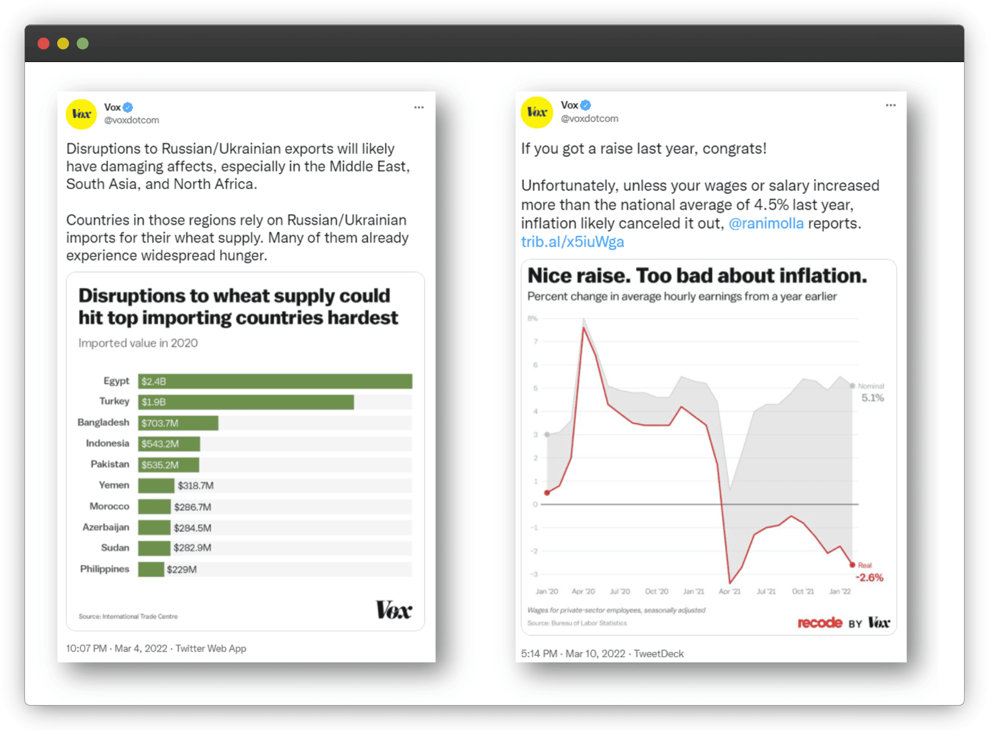
And charts and graphs are just the right tools to help your audience consume complex information easily and much faster — because everybody skims, eh?
[Source]
This article lays out why they are useful for social media marketing, explores the types of charts and graphs that you can use for your social media posts, how to weaponize them to hit the bullseye of engagement and reach, and focuses on the KPIs that matter for correctly measuring their impact on your social media performance.
Let’s dive in already!
4 Reasons Why Charts And Graphs Are Useful For Social Media Marketing
Catches Attention Quickly
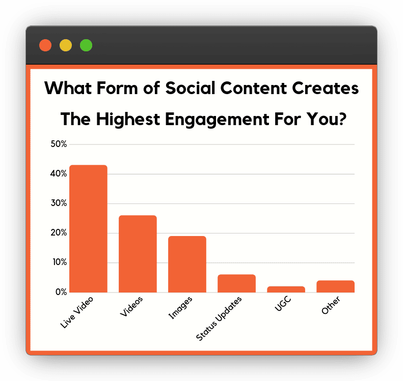
We process visual information much faster than text. So, compared to text-heavy content, visuals are more likely to stand out and attract eyeballs.
[Source]
This makes charts and graphs a solid weapon to grab the attention of your followers as they scroll through their feeds. This is especially relevant with social selling news where the objective is to capture and convince the prospective buyer. Interestingly, this also increases the likelihood that they’ll remember the information you’re presenting.
Simplifies Complex Data
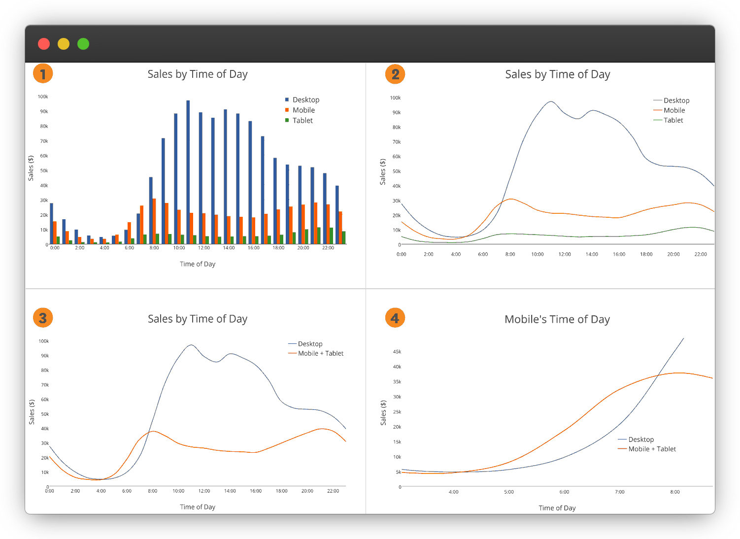
Charts and graphs help you present complex data and insights concisely and in a format that is easily digestible.
Instead of bombarding your audience with lengthy paragraphs or raw numbers, charts and graphs condense the information into visually organized patterns. This simplification makes it stupid easy for your followers to absorb the essential messages you’re looking to communicate — like a sponge.
[Source]
Meaningful visual representations of data enable you to highlight patterns, trends, or correlations, allowing your audience to quickly identify key insights.
If you are making an infographic, such graphs and charts help highlight your points more effectively than plain text.
Widens Content Reach
Social media users have a short attention span. So, they’re innately drawn to visually appealing content and more likely to interact with it.
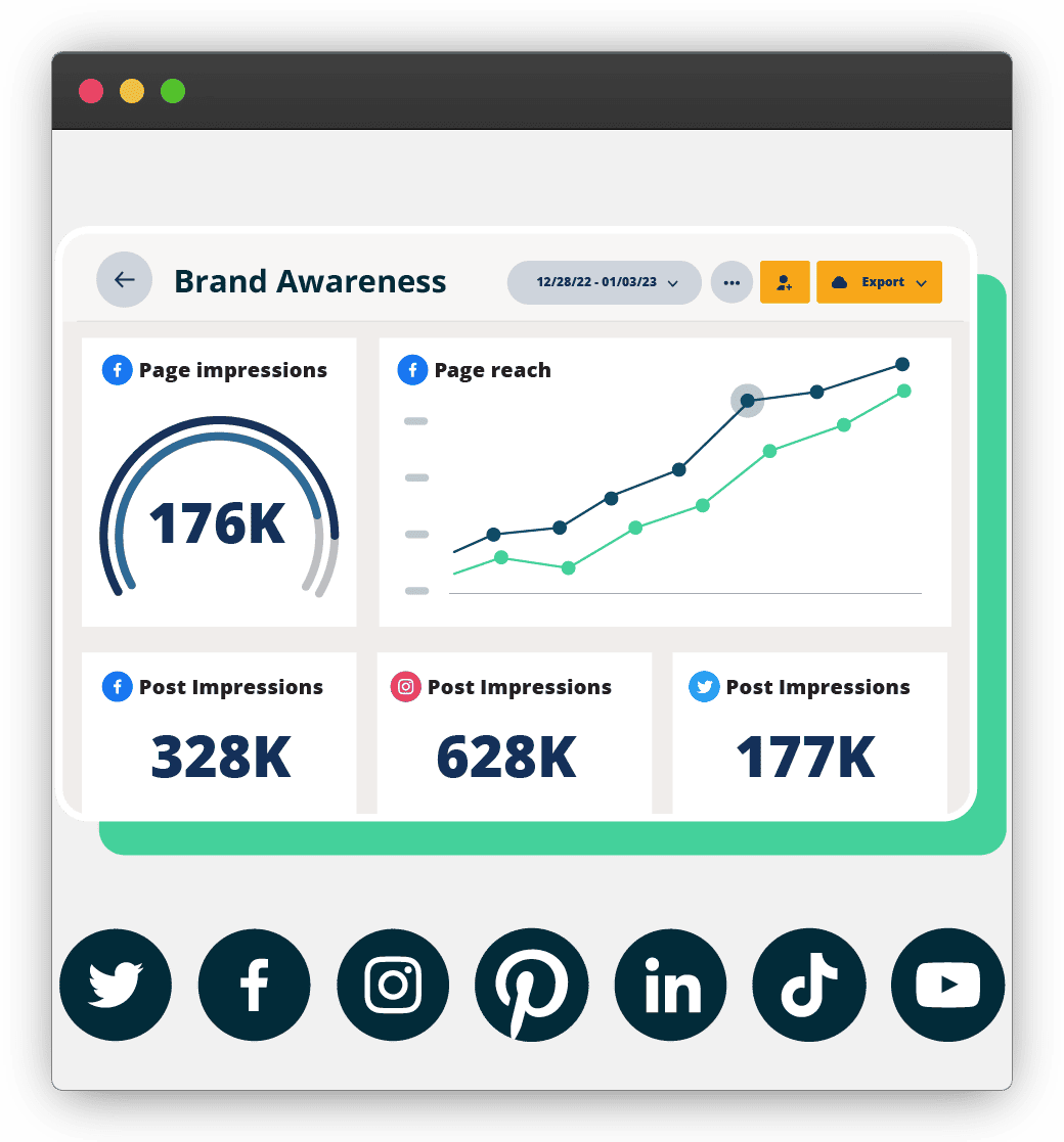
By using eye-catching charts and graphs, you quickly take over the audience-attention real estate, helping marketers analyze performance and refine social media marketing workflows across platforms. They prompt viewers to analyze the data, interpret the insights, and potentially share their own observations or opinions. And when this organic interaction happens, your content reaches a wider audience, increasing visibility and expanding your social media reach.
[Source]
Interactive charts and graphs can be particularly effective for driving discussions, encouraging comments, and building a sense of community among your social media followers.
Helps You Become An Industry Thought Leader
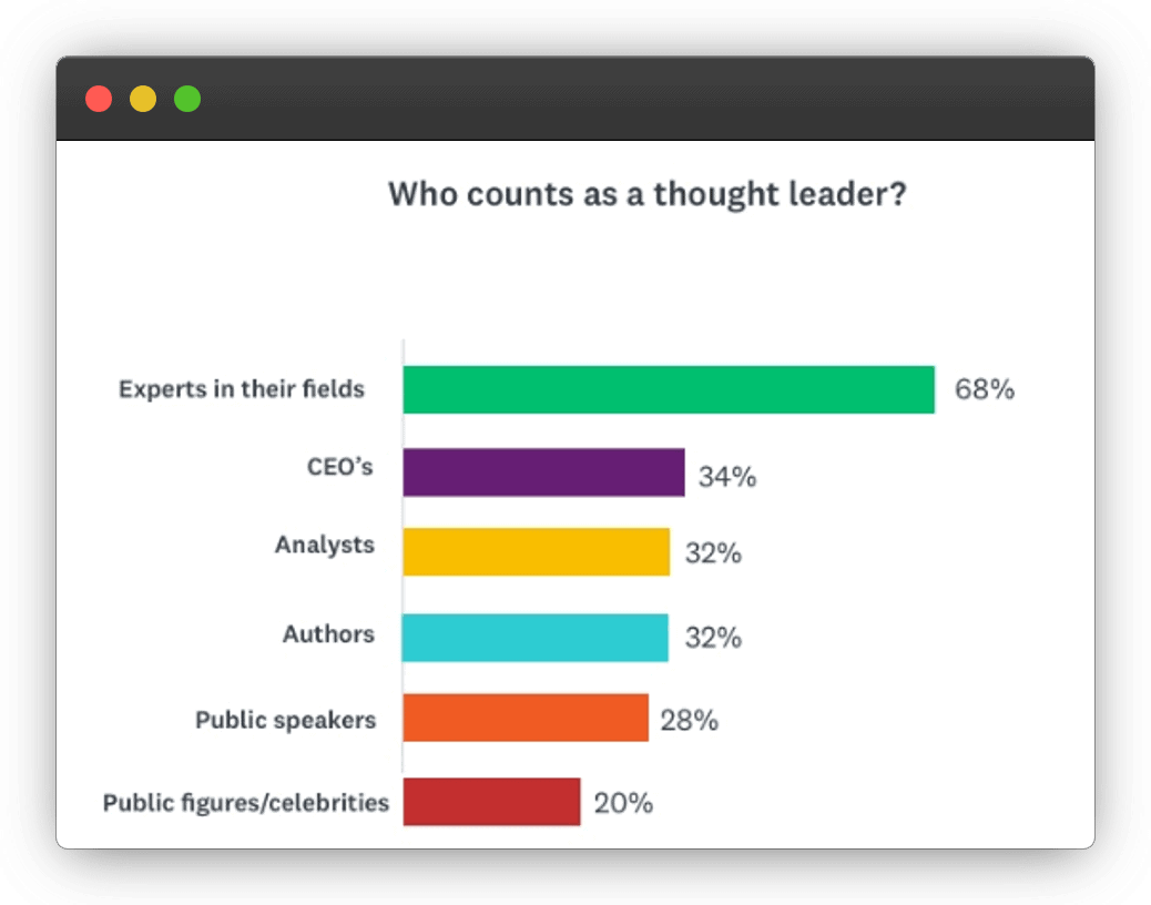
Visualizing data and statistics demonstrates that your statements or claims are backed by evidence and factual information. When your audience can see the data for themselves, they are more likely to believe in the information you are presenting.
[Source]
Plus, using charts and graphs is an authoritative way to share your in-depth subject matter knowledge. Over time, this can help you build a reputation as a thought leader, making your content more trustworthy and increasing your influence within your industry.
4 Types Of Charts And Graphs For Social Media Marketing
1. Pie Chart
What Is A Pie Chart?
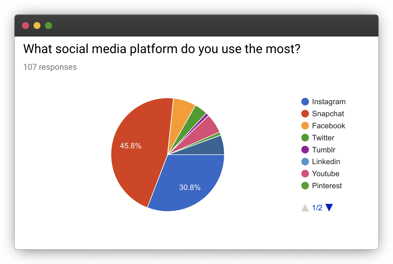
A pie chart is a circular graphical data representation where the whole pie represents 100% or the total amount. This pie is divided into slices — with each slice representing a specific category or data point. The size of each slice corresponds to the proportion or percentage it represents relative to the whole.
[Source]
Pie charts are commonly used to visualize categorical or percentage-based data — making it easier to understand the distribution and relative magnitudes of different categories.
When To Choose A Pie Chart For Your Social Media Posts?
- If you’re promoting multiple products or services on social media, a pie chart can be effective in showcasing their market share or customer preferences. It can provide a visual comparison of how the offerings are distributed among different categories or customer segments.
- Pie charts are great for presenting survey findings. They can be used to display the distribution of responses or opinions for different survey questions, enabling viewers to quickly understand the overall sentiment or trends.
2. Bar Graph
What Is A Bar Graph?
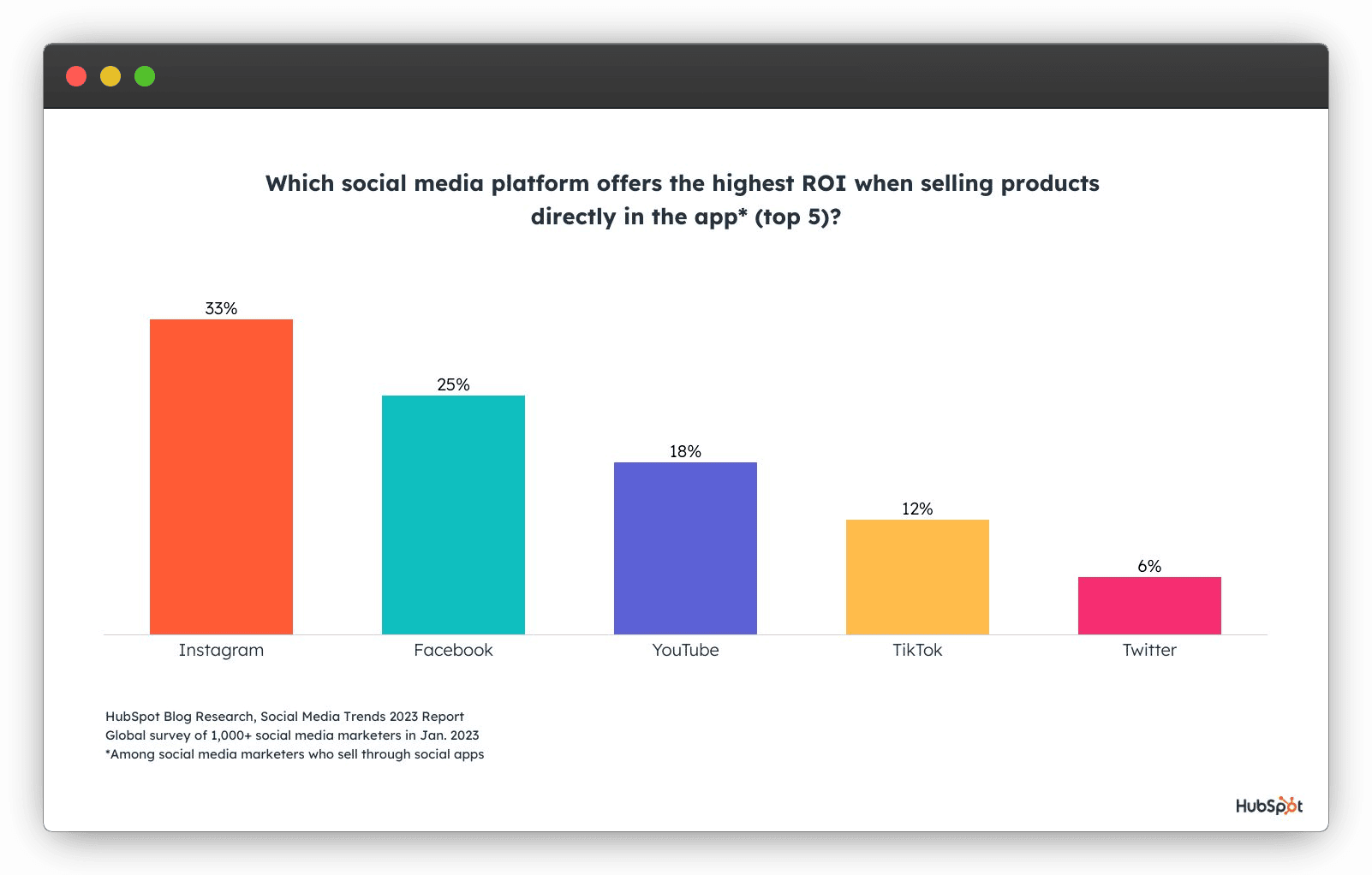
A bar graph (commonly called a bar chart) is a graphical representation of numerical data using rectangular bars. Each bar represents a category or data point, and the length or height of the bar corresponds to the quantity or value of the data it represents. The bars are mostly aligned along the X-axis (horizontal bars) or the Y-axis (vertical bars).
[Source]
Bar charts are commonly used to compare different categories or data points — allowing for easy visualization of comparisons, patterns, and trends in the data.
When To Choose A Bar Graph For Your Social Media Posts?
- When promoting multiple products or services, bar graphs can be used to highlight and compare their key features or attributes. This visual representation can help viewers quickly understand the differences and make informed buying decisions.
- Bar graphs can present the results of polls conducted on social media. You can use them to display the distribution of responses, opinions, or preferences — making it easier for viewers to understand the collective trend(s) among the participants.
3. Line Graph
What Is A Line Graph?
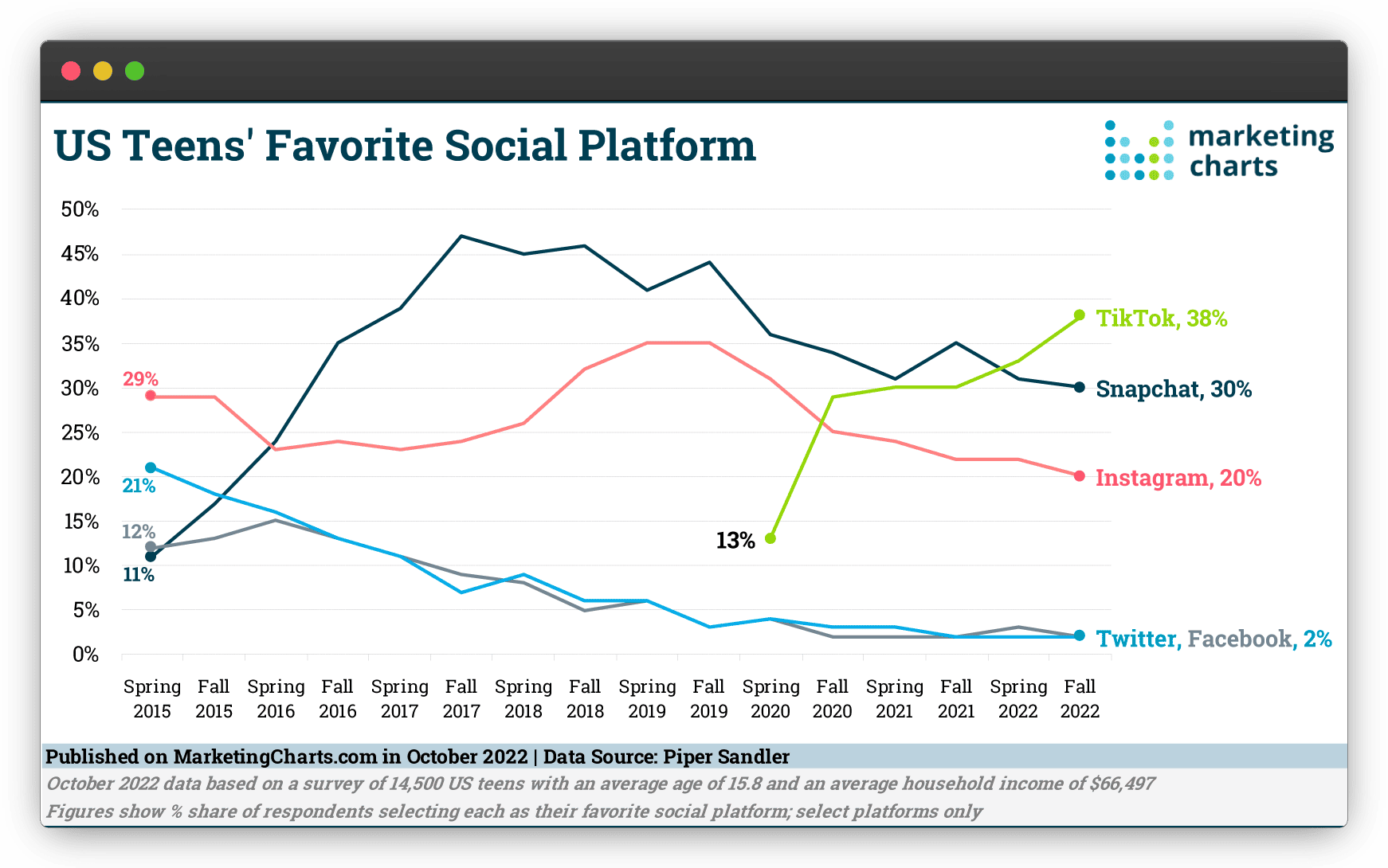
A line graph displays data points connected by straight lines. It is used to represent the relationship or trend between two variables over a continuous or sequential range. The X-axis typically represents time or another independent variable, while the Y-axis represents the dependent variable.
[Source]
Line graphs are especially useful for showing patterns, trends, or fluctuations in data over time. They provide a visual representation of how the values of the variables change and allow for easy comparison and analysis of data points. They are commonly used to visually demonstrate financial and sales data.
When To Choose A Line Graph For Your Social Media Posts?
- Line graphs are a powerful tool for tracking progress towards specific goals or milestones. By plotting the desired target line alongside the actual data, you can visually represent the progress made over time. This not only keeps you accountable but also helps your audience understand the progress you have made and the goals you are striving for — making them more involved with your brand.
- They are effective when you want to compare multiple variables simultaneously. You can plot multiple lines on the same chart to showcase the performance of different products, marketing campaigns, or competitors. This allows your audience to visualize and compare the trends and patterns across different categories or segments.
4. Bubble Chart
What Is A Bubble Chart?
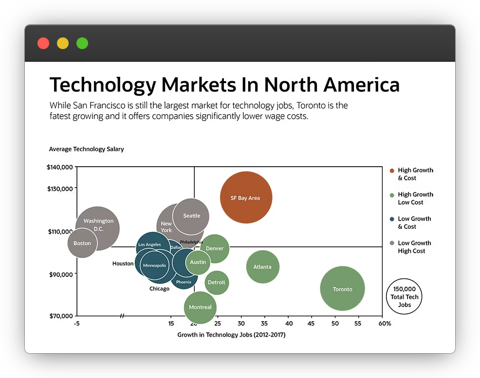
A bubble chart displays data using bubbles or circular markers on a 2-D coordinate system. It is used to represent three variables simultaneously, where the position of the bubbles corresponds to the values of the two variables, and the size of the bubbles represents the value of the third variable. The X-axis and Y-axis represent the two independent variables, while the size of the bubbles represents the dependent variable.
[Source]
Bubble charts are useful for visualizing and comparing data points that have multiple dimensions or attributes. They can show patterns, relationships, or clusters within the data and provide a visually engaging representation of complex datasets.
When To Choose A Bubble Chart For Your Social Media Posts?
- Bubble charts can be used to present survey responses in a more interactive and engaging format. Each bubble represents a respondent, and the position of the bubble on the chart can represent their response on different scales or dimensions. This helps you showcase the distribution of responses and identify any clusters or patterns.
- They are ideal for visualizing relationships between three variables. Bubble charts allow you to compare and analyze the relationships and patterns among the variables. You can use it to share complex company’s financial data with your audience — which can help fuel further follower growth.
The above list is not comprehensive. There are a number of other chart formats including flowcharts, treemaps, candlesticks, histograms, etc. that can be more relevant to your social media campaign depending on the kind of information you want to convey, and the industry you are in.
Invest in a tool like Google Charts to explore a wide variety of charting formats that can best showcase your content.
Best Design Practices (Regardless Of Your Chart Or Graph Choice)
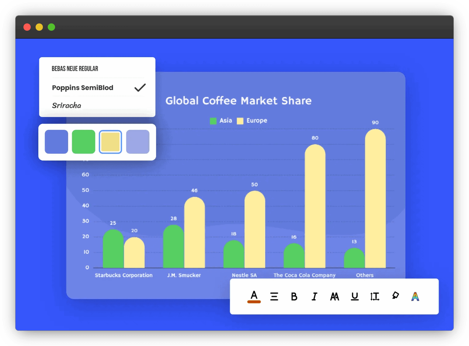
- Avoid clutter and keep the design clean. Focus only on the essential elements and remove unnecessary details that may distract or confuse your audience.
[Source]
- Choose colors that are visually appealing and align with your brand’s aesthetics. Use contrasting colors to differentiate between different data points or categories.
- Select the appropriate chart type based on the data you want to present. Consider the purpose, data relationships, and the story you want to convey. Every chart type has its own strengths and is suited for specific data representations.
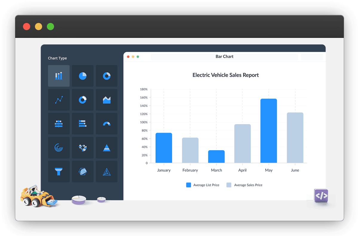
- Use clear and concise labels for each element in the chart or graph, like axis labels and data points. Add a descriptive title to provide context and help your audience quickly understand what the chart represents.
[Source]
- Optimize your charts and graphs for mobile viewing, as most users enjoy social media content via their mobile devices. Ensure that the visuals are clear, legible, and easily viewable on smaller screens — so they don’t have to zoom in.
- Highlight the key findings or insights derived from the chart or graph to be skim-proof. Add captions, annotations, or callouts to draw attention to important data points or trends. This helps your audience quickly grasp the main takeaways and understand the data significance.
5 KPIs To Measure The ROI Of Using Charts And Graphs In Social Media Campaigns
At the outset, the ROI of using charts and graphs is directly measured by how much time and money you invest with subscriptions for these applications, and the direct increase in revenue due to this. However, quite often than not, this is not as straight-forward since these tools do not directly correlate to conversion. Instead, they contribute towards brand trust and legitimacy which, in turn, contributes to higher sales.
As such, these are some of the metrics you should look for.
Impressions
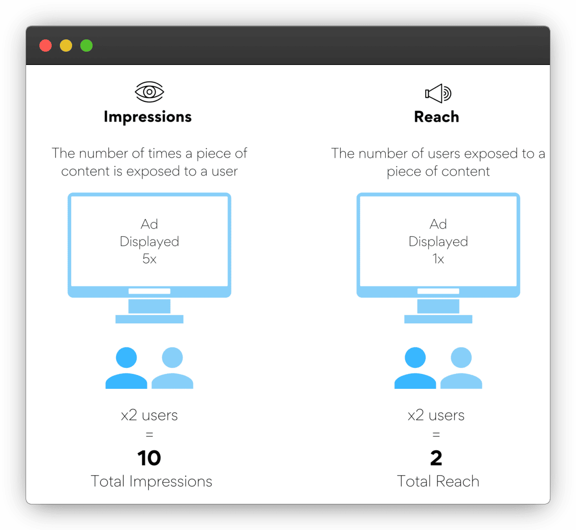
Impressions measure the number of times your chart or graph was displayed to social media users — interaction, not considered. Each time your post is shown on a user’s feed, it counts as an impression.
[Source]
Analyzing the impression data helps you assess the effectiveness of your content distribution strategies. Comparing impressions across different posts or campaigns can also help you identify trends and patterns in terms of content performance and audience engagement.
Pairing impression data with other engagement metrics, such as likes, comments, or clicks, can provide a more wholesome understanding of the overall impact of your social media marketing efforts.
Likes And Reactions
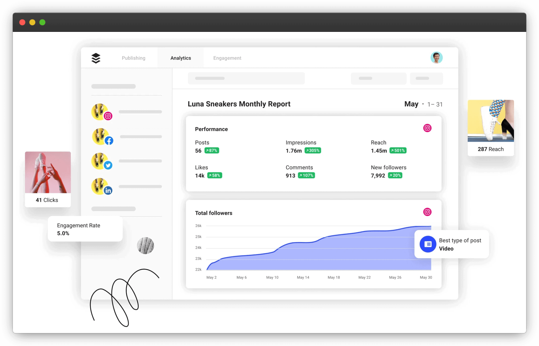
Likes and reactions is an indicator of social proof and underlines how appealing and interesting your charts or graphs are to your audience. They show that users have taken the time to interact with your post and express their appreciation or agreement.
By tracking them, you can gauge if they’re into data, and this can inform future content decisions. Plus, high numbers of likes and reactions also help increase brand awareness and reach as social media platforms prioritize content that receives higher engagement (because it affects time spent inside the app — a win-win!).
[Source]
Comments
Tracking the number of comments received on your social media posts helps measure the level of generated engagement and conversation.
By analyzing the content of the comments, you can gain a deeper understanding of how your audience interprets your charts or graphs. You may uncover additional perspectives, questions, or concerns that can help you refine your messaging or address any missing parts.
Click-Through Rate (CTR)
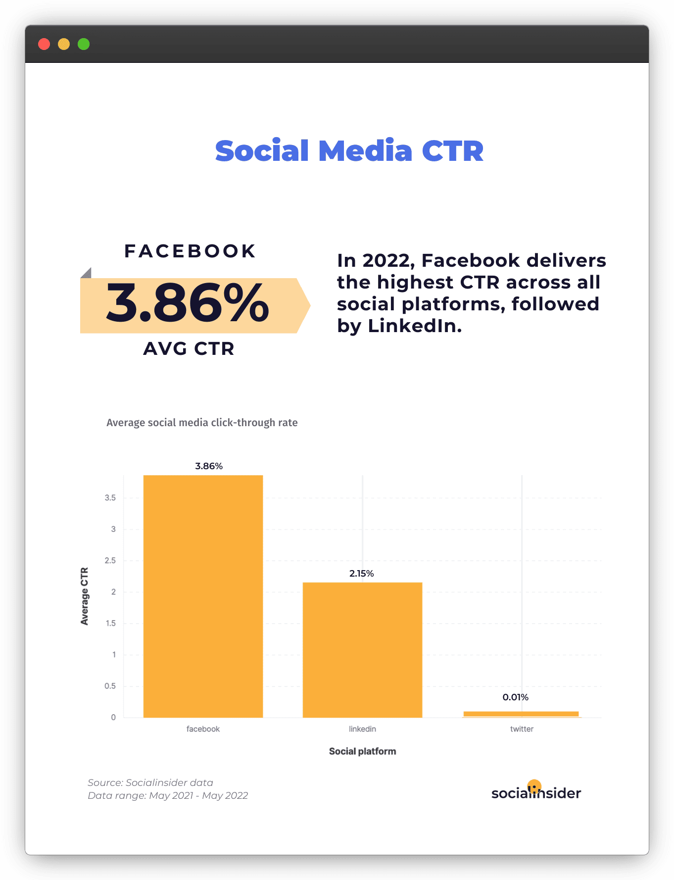
CTR measures the percentage of your audience who clicked on your chart or graph, redirecting them to your website or landing page. A higher CTR indicates that your chart or graph has successfully captured the attention of your audience and motivated them to take further action by clicking on the content.
[Source]
This metric is particularly important for evaluating the effectiveness of your social media marketing efforts in driving traffic and conversions — basically, the potential of increasing revenue.
Brand Mentions
An increase in brand mentions signifies that your charts or graphs have resonated with your audience and have been shared or discussed by them. This social sharing expands the brand visibility and reach — potentially attracting new followers or customers.
Tracking this also allows you to identify influential users or communities that are engaging with your content, providing opportunities for organic collaboration with nano and micro-influencers.
Final Words
Including charts and graphs in your social media strategy is kinda sureshot way to convey your message backed with data more clearly, emphasize a particular point to drive the narrative home, and quickly grab the viewer’s attention.
The type of chart you choose depends on the type of data you want to present. If your goal is to tell a story with your data, go with a line graph. And if you want to grab attention and encourage conversations around your posts, pick a bar graph or a pie chart.
You can also combine different types of charts and graphs together in an infographic — increasing the shareability and therefore the virality factor.
So, are you gonna chart today?

