We are living in the age of information and business intelligence is becoming the norm to make better decisions.
With billions of people using social media, the amount of data is huge. This data can be a gold mine for businesses if used efficiently.
[playht_player width=”100%” height=”175″ voice=”Mark”]
By using data, you can evaluate your social media strategies and gauge the effectiveness of your marketing campaigns. You can find a lot of analytics tools offering almost the same services with a slight degree of variations. Learning to use Excel effectively is one of the most efficient ways to derive insights from your data.
With Excel, you can build an interactive template to analyze your social media strategies and see what’s working and what’s needs to be changed
 In this article, we will try to build a basic social media Excel template using different features of Excel.
Buckle up!
See the above worksheet where basic information for the last 10 days of Twitter postings is recorded. We will be using Excel features to make it a proper template that can be used for future analyses.
Here is a quick tour of the above worksheet
| Column Name | Description |
| Date of Post | Date when the content was posted on the platform |
| Post Content | The subject of the content |
| Category | Categories of posts defined by the firm e.g., educational posts, announcements, etc. |
| Retweets | No of the times a post was retweeted by users |
| Likes | Total no of likes on the post |
| Mentions | Total no of mentions of the handle by users |
| Clicks | Total no of clicks by the users |
| Engagement | Sum of all the retweets, likes, mentions, and clicks |
Now let’s roll our sleeves to make it a professional-looking template that is easy to use and gives you actionable insights.
Date Formatting
Date formatting is used to adjust the dates according to our preferences. Excel has a long list of predefined date formats that are being used in different regions. Like commonly used date formats in US and UK.
Apart from the predefined date formats, you can also create a customised date formatting style. In our template, we will be changing our dates from UK standards to a standard US format.
To do that, first, select the entire date range and then right-click to open the Format Cells menu.
The shortcut key to open the Format Cells menu is CTRL+1.
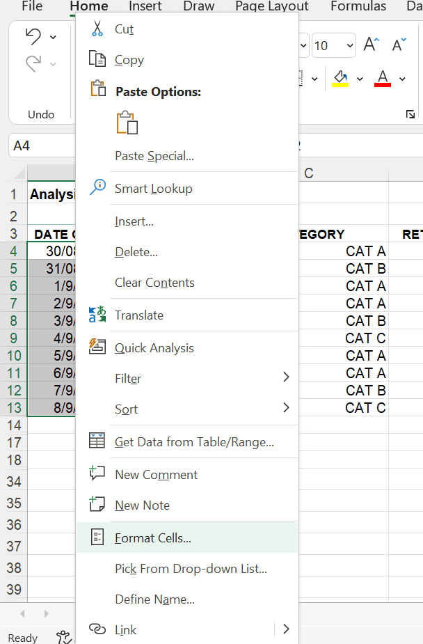
After clicking the Format Cells…., a new window will appear.
From there, select the Date from the Category appearing on the left side of the window.
After clicking you will see a long list of predefined formatting styles on the right side of the window. These are relevant to the location that you can see below that list.
If you want to change the location, click on the drop-down menu available below the formatting styles and select the location you would like. In our example below we are currently showing UK options but selecting to change to US options.
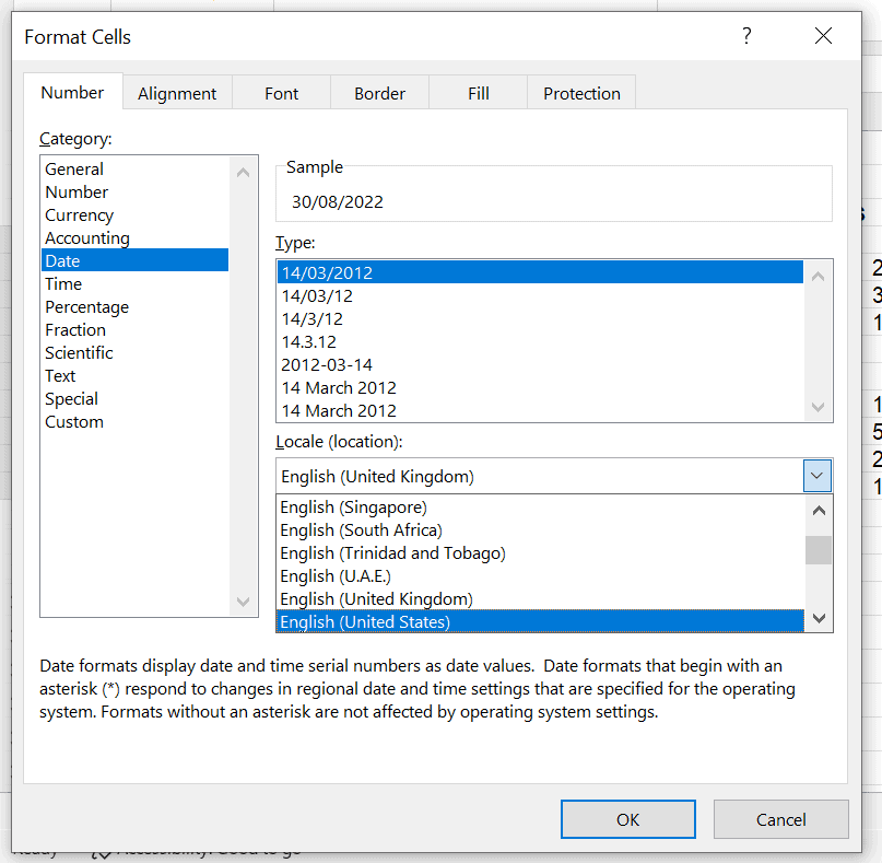
After clicking the English (United States) option, all the commonly used formats in the US will be available for you to choose from.
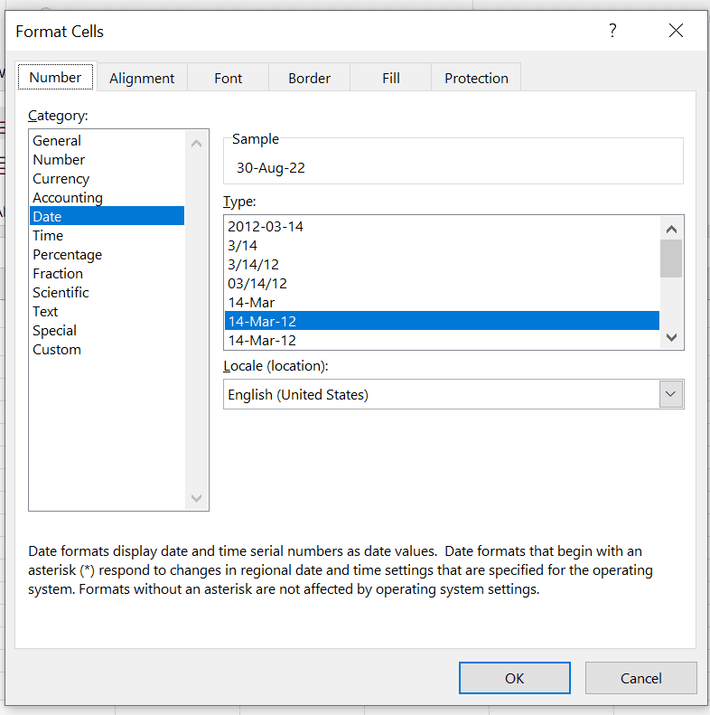
After selecting your desired formatting style, click on OK and your dates will be formatted accordingly.

Data Validation
Data validation is an important feature in Excel that is useful to avoid data input errors. It makes sure that data is in the desired format when entered into the sheet.
We can use data validation in the above sheet to ensure that only whole numbers are fed into columns D to G. This would eliminate any handling errors during the data recording process.
To use data validation, select the required range and then click on the Data Validation icon in the Data tab.
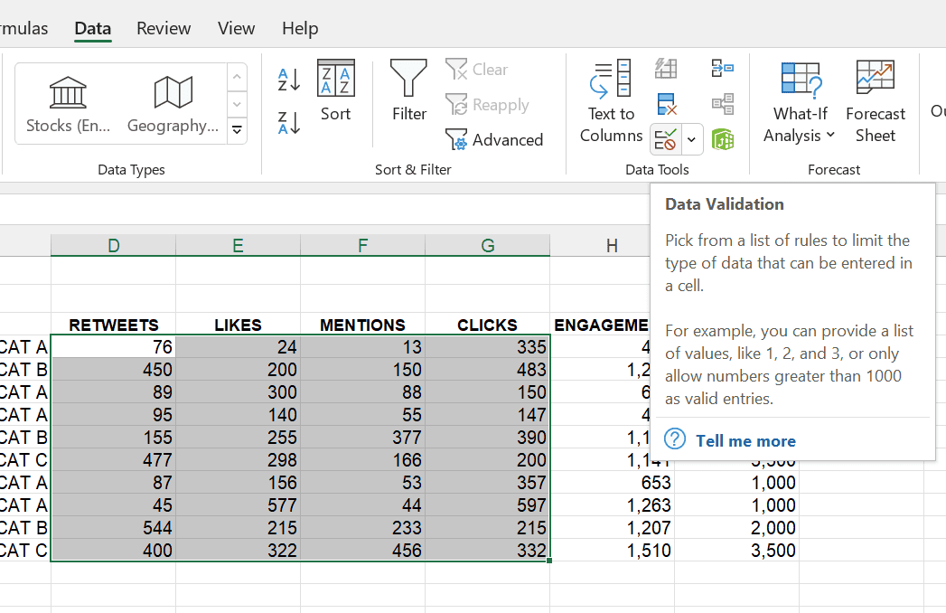
A new window will appear to input the requirements for data validation.
In this example, we have selected Whole numbers from the drop-down. After selecting the Whole numbers option, you need to enter the minimum and maximum values also.
In the above example, minimum 0 and maximum 10000 are entered.
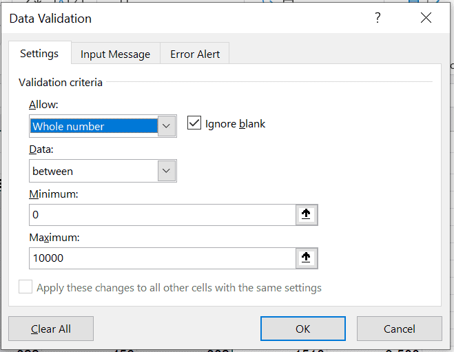
After entering all the criteria click on OK. Now the selected data range is protected from any data handling errors. Let’s check it out.
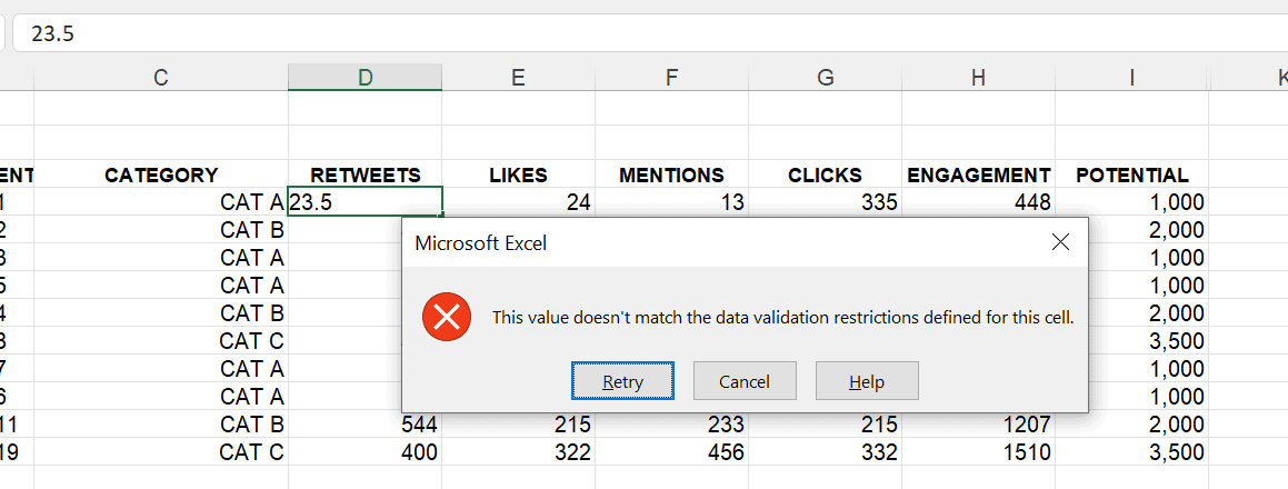
When a decimal number is entered in one of the cells from the validated range, Excel will show an error that the value doesn’t meet the validation criteria.
There are plenty of other options in the Data Validation menu that could help you make your worksheet error-free like defining the minimum and maximum value to be entered or a customized error message when the criteria are not met.
Number Formatting
Number formatting is useful to give a professional look to your worksheet and make sure that is easily readable by your audience.
There is a wide range of number formatting options that Excel offers as you might expect. You can format your numbers as currencies, whole numbers, decimal numbers, decide the numbers after the decimal, and many more options.
For our template, we will apply number formatting to include thousand separators so that large numbers are easily readable.
We will apply number formatting from column D to H, to do that, select the range of numbers and right-click anywhere within the selected range to open the formatting menu.
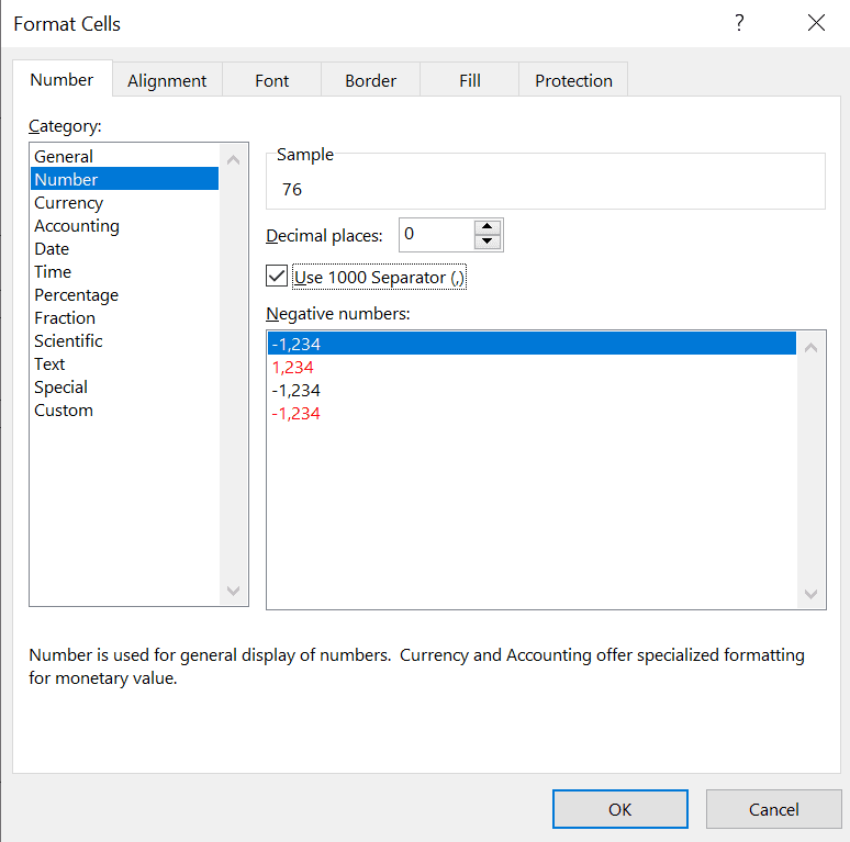
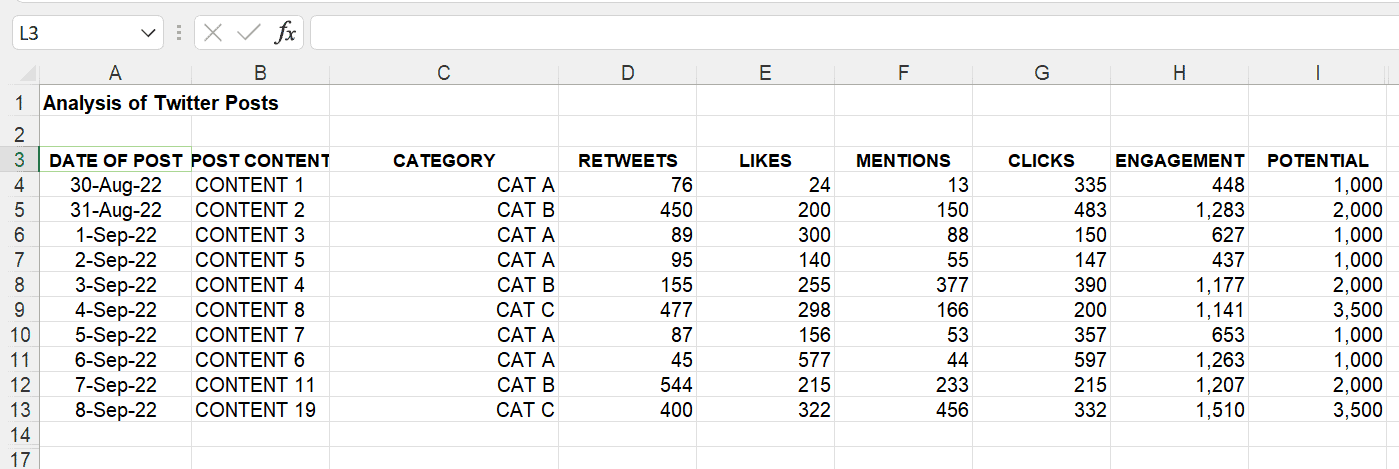 After clicking OK, the numbers will be formatted as below.
IF Formulas
IF formulas are helpful in setting up conditional columns to segment your data.
You can use IF formulas with single or multiple criteria.
In our template, we will use the IF formula to identify the potential of the post based on its category.
We have 3 categories in our post and based on our data the potential for post categories is as follows:
CAT A: 1,000
CAT B: 2,000
CAT C: 3,500
Now, we want our template to automatically identify the potential based on the post category.
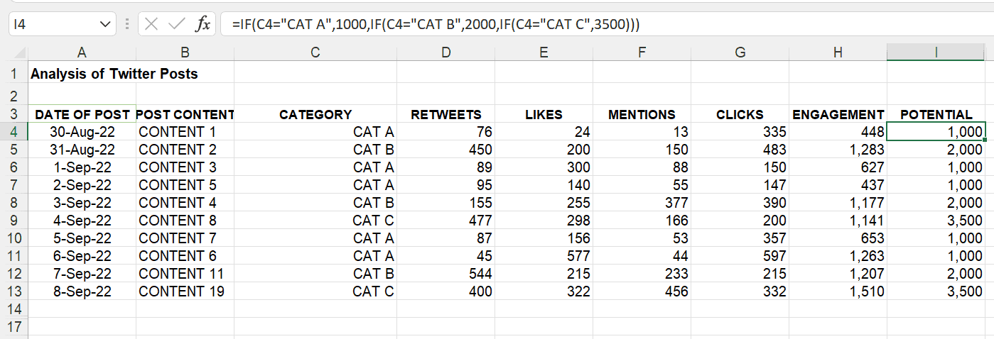
Let’s insert a column named “POTENTIAL” to identify the potential of the post based on its category. Below is the formula that we have used:
=IF(C4=”CAT A”,1000,IF(C4=”CAT B”,2000,IF(C4=”CAT C”,3500)))
After entering the formula in cell I4 and dragging it to the rest of the cells, the potential for each post will be identified.
Explaining the full details of using an IF statement is beyond the remit of this article. See this article on IF statements for full details
Percentages
Percentages are great to measure effectiveness, growth, and other parameters within your data.
You can format plain decimal numbers that are not easily readable into percentages. Percentages help analyze the data at a faster pace.
In Excel, you can format your numbers into percentages easily. To use percentages in our template, we have entered a new column named “EFFECTIVENESS”.
The “EFEECTIVENESS” column will measure the results of our posts by dividing the “ENGAGEMENT” by “POTENTIAL”.

You can see in the above screenshots that simply dividing the two values are not good to get insights. To make them more insightful, we need to convert them into percentages.
Simply select the range of values and right-click to open the Format Cells menu.
From there, select the Percentage from the Category section
You can adjust the decimal places the way you like, in this example, we have set the decimal places at 2.
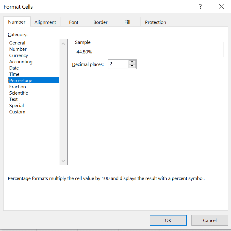
 Once you click on OK, the decimal numbers will be formatted as percentages
Average and SUM Functions
Average and SUM functions are used to aggregate the values to provide a summary of the data. Average is used to calculate the average for selected values while SUM is used for summing up the values.
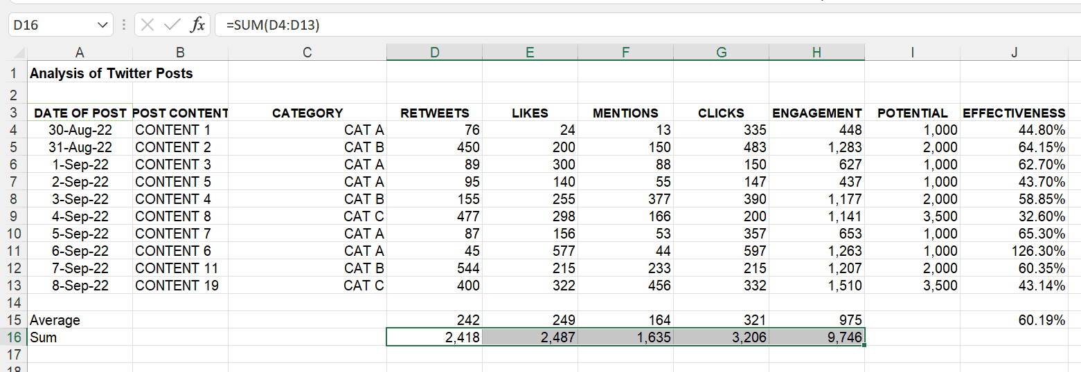
We can use both functions in our template to calculate the average and sum for all the fields.
First, we will be calculating the average by using the following formula
=Average(D4:D13)

To calculate the average for the other remaining columns, you can drag the calculated cell toward the right of the sheet. Another way to do that is by copying the cell by CTRL + C and pasting them to the cells by pressing CTRL + V.
 Now, to calculate the sum, we will be using the below formula
=sum(D4:D13)
Conditional Formatting
Now that our template has started looking more complete, it’s time to add some details to make it more readable.
Conditional formatting in Excel has so many options to offer that you can use to make your templates and report more readable and actionable.
You can use conditional formatting to highlight values meeting specific criteria, use data bars to add visualisation to the numbers, highlight duplicate values, or many other things.
Excel has a very wide selection of possibilities for conditional formatting with pre-built options and custom options as well.
Conditional formatting can be used with any type of data including text, date, time, and numbers.
Now, let’s use conditional formatting to highlight interesting data in our template. First, we will highlight above-average values in every column from D to H using conditional formatting.
To do this, follow the below-mentioned steps
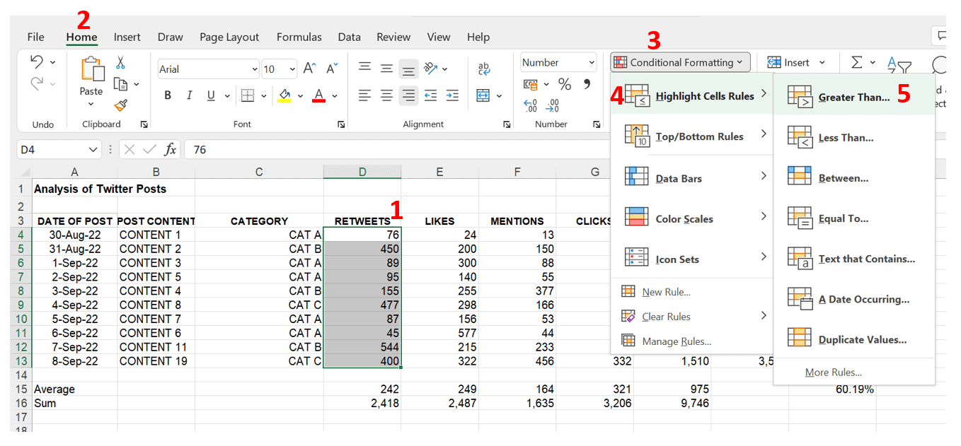
Step 1: Select the range of values to be formatted, in this case, from cell D4 to D13
Steps 2 & 3: On the Home tab, click on the conditional formatting menu
Step 4: Click on the Highlight Cells Rules to open its sub-menu
Step 5: Click on Greater Than…. option.
After clicking on the Greater Than option, a new window will appear to input the criteria for highlighting the cells. The average for the RETWEETS column is 242. So, any value greater than 242 must be highlighted.
Now, to input the criteria value in the box (see screenshot below), click on the average value for the column and Excel will automatically pick up the cell reference for the value. In this case, you can see =$D$15 in the input field which corresponds to the average value of 242 is picked up by Excel.
Pro-tip:
If you use cell reference =D$15 Excel will lock the row reference and only change the column reference so that you can copy the cell formatting across the sheet.
To learn more about absolute cell references see this article.
With this, we can simply copy the formatting style of this range to the adjacent columns.
Another thing to remember is that you could just input your criteria values manually but then the adjustment would not be dynamic. Using a formula means that if you adjust one of the numbers in the spreadsheet then the conditional formatting also automatically updates.
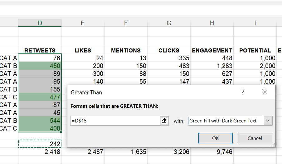
After clicking OK, all the above-average values in the range will be highlighted with your chose colour.
To format the remaining columns:
Step 1: Select the entire range of formatted values
Step 2: Click on the Format Painter button from the Home tab.
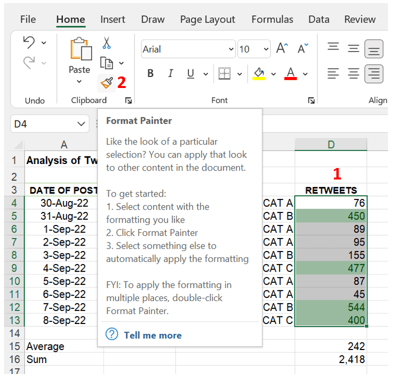
Step 3: After clicking the Format Painter button, select the range of values you want to apply the formatting, in this case, from cell E4 to H13. Once you release the mouse button after selecting the target range, the formatting will be copied to the highlighted range.

Another conditional formatting that we can do in our template is to use data bars in the EFFECTIVENESS column to make it more presentable and readable.
Below is the procedure for applying data bars to the values.
STEP 1: Select the range of values, in this case from J4 to J13
STEP 2: Click on the conditional formatting menu
STEP 3: Go to the Data Bars sub-menu and select one of the fill styles
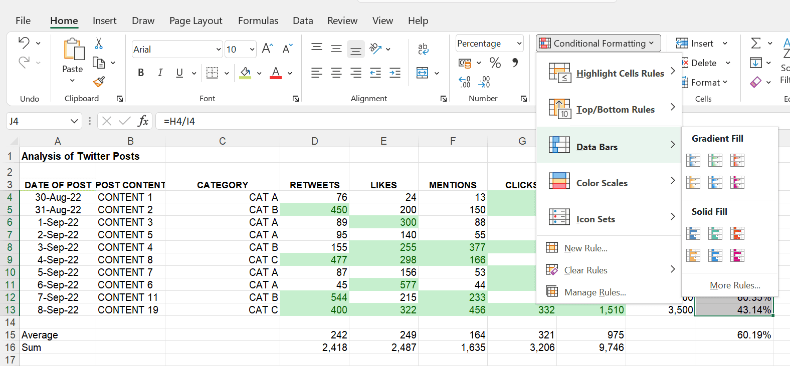
After clicking on one of the styles, data bars will be applied to the highlighted values.
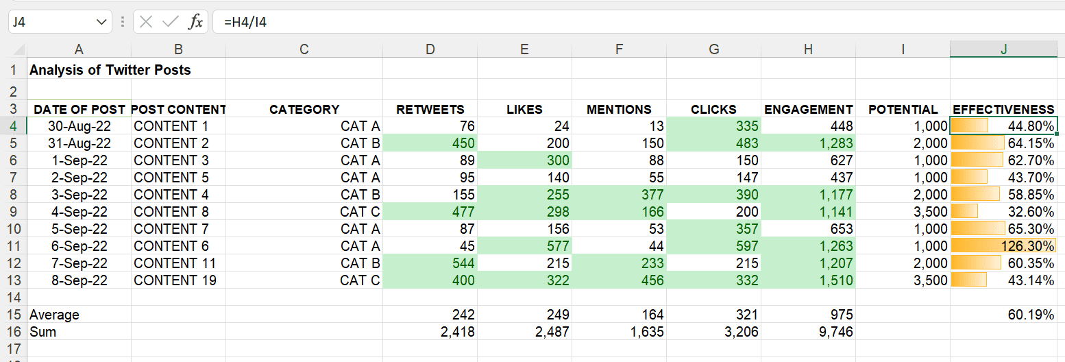 Here is the final shape of our template ready to give actionable insights to drive social media activities with more precision.
Once the template is ready according to your requirements you can use it for all your future analyses.
Create a Social Media Excel Template
Excel is a great tool that you can use to do basic to advanced levels of analysis for all your business requirements. With current updates, you can now connect with multiple data sources to fetch the data directly into the workbook and start working.
You can also make a fully interactive dashboard showing all your key business metrics to make better decisions. Keep Excelling!

