Do you know how many posts are being published across social media platforms right now? Every day, over 300 million photos are uploaded on Facebook, 300 hours of video on YouTube, and over 500 million stories on Instagram. The list goes on and on – and it only keeps growing as time passes.
The struggle to rank higher in searches becomes bigger because of this. Unless you create the right content for your audience, publish it at the right time, and target the right people – you won’t be able to boost engagement on your social media profiles.
What you need in these competitive times are engaging pieces of content. Infographic social media posts are one such example. With the growth in the demand for bite-sized, visual content we’re witnessed in the past couple of years, social media infographics marketing has become a must for marketers.
What are Social Media Infographics?
Infographic is a visual piece of content that presents some information to the person who sees it. Whether it is a list of numbers and dates or a step-by-step list, an infographic can be used to convey important information in the form of an engaging visual.
Maybe you haven’t paid much attention to it, but social networking infographics are actually all around us. When you buy an appliance, the step-by-step installation or usage process usually comes in the form of an infographic. Just check your home milling machine – isn’t there an illustrated manual that comes with it?
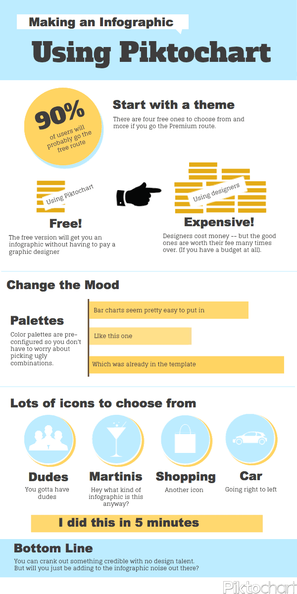
Creating this piece of content is now easier than ever. You don’t have to be a graphic designer or have advanced computer skills to create engaging visual pieces. Thanks to tools like Piktochart, you can pick and choose from an amazing list of Infographic templates, add your information to them, and post them on your social media channels. They’ve even created a guide for using Piktochart’s templates (in the form of infographic, of course).
Using infographics for your social media marketing
The Content Marketing Institute has reported that 65% of B2B marketers have used infographics in their marketing at some point. This makes infographics one of the top 5 most used content types across the Web. It is also what prompted the survey creation of Infographic World, where it was discovered that 84% of respondents find this content medium effective.
Below you can find some of the biggest reasons why you need to use infographics in your social media marketing strategies.
1. Humans are attracted to visuals
Scientific research has proved over and over again that humans are more attracted to visuals than to plain text. In fact, adding images to text is said to enhance people’s learning abilities by no less than 323%!
What does this tell you?
It tells you that people are visual beings, which makes them more attracted to visual content than plain text. This is even more emphasized on social media where most of the content comes in visual form. Platforms like Facebook and Instagram are filled with posts with featured images, live videos, and stories, all combined with a bit of text in photo descriptions and comments. Wishpond has discovered that a post with an image receives 94% more engagement and visits than a post without one.
Since infographics are basically images with a bit of text spread across, they make for an ideal way to appeal to a wider audience.

2. Faster to read. Easier to understand
People are busier today than ever. They don’t have forever to spend on social media posts. If you have a plain post that consists of content, regardless of the information’s nature, chances are they won’t even give it more than a glimpse.
One or two decades ago, digital marketers had over 10 seconds to interest people in their content. Today, this span has shortened to as little as 8. This is why you need content like infographics – to grasp people’s attention right away and deliver the information without taking too much of their time. Infographics are an excellent example of easily digestible content.
3. Less time-consuming and more usable
When you write content for a blog, an article for a guest post, or a large guide for your pages, you need to spend quite some time crafting it. The content doesn’t just take time to write, edit, and proofread. It is also limited in terms of usage.
Why is this?
When you publish big chunks of content as part of your infographic social media marketing strategy, such as videos or articles on your website, that’s all you can use it for. If you want to use it on other sites, you have to start again – create a new piece of original content.
Infographics are different. Unlike traditional text content that needs to be diverse, infographics can be shared all across the web. You can share them on your website and blog, across various social media channels, in guest posts, etc.
And of course, it takes less time to craft 100 to 250 words than it takes to write a 2,000-word article. There’s no preparing for the camera or shooting endless attempts like when you’re making a video. The goal of this medium is to be concise and to the point. The fewer words you use to present the information, the better.
4. Better chances of your content going viral
One infographic can be shared across different social media channels and websites. This immediately gives you a wider reach. You can even send it via email, print out materials with your infographic, and repost it many times.
Not only is it easy to spread around, but it is also easy to share. According to Hubspot, your audience is 3 times more likely to share this type of content on social media than any other type. As long as you have valuable content and a visually appealing infographic, you can achieve wonders with a single image.
5. Make dull and old content engaging
You can work weeks on a single piece of content and not even come close to reaching your audience knowing when to post on social media infographic and you consider it. No matter how often and where you publish it, it simply doesn’t bring you the reach you aimed for.
Sounds disappointing, but it happens very often – and to everyone. However, there’s no reason why you should toss your hard work aside and move on to a new idea. If you had a good idea but your content didn’t bring the results you wanted, there’s one more solution – repurpose it.
The same applies to old content that you haven’t used for a while. It’s futile to re-share the content over and over again, but what if you present it in a fresh, engaging way?
The answer is – an infographic.
Infographics are a marvelous way of repurposing text-heavy, old content. This eliminates the need to think of new topics, perform endless research, and spend days writing a new blog piece. Just choose some of the older content pieces or a piece that didn’t work as you intended it to, and convert everything into bite-sized information.
The result? An infographic that puts a fresh twist on what you wrote before.
Best tips and practices for your infographic marketing
Now that we’ve established how useful this medium can be for your marketing strategy and brand recognition, let’s learn about the best practices for creating and using infographics.
Discover the purpose for your infographic
Infographics are engaging pieces of content, but they will only work if you use them to present the right kind of information. In addition to repurposing old content, infographics are used for:
· Sharing survey or research data findings

· Providing facts and statistics relevant to your industry, product, or service

· Creating a simple, easy-to-scan guide for a step-by-step process
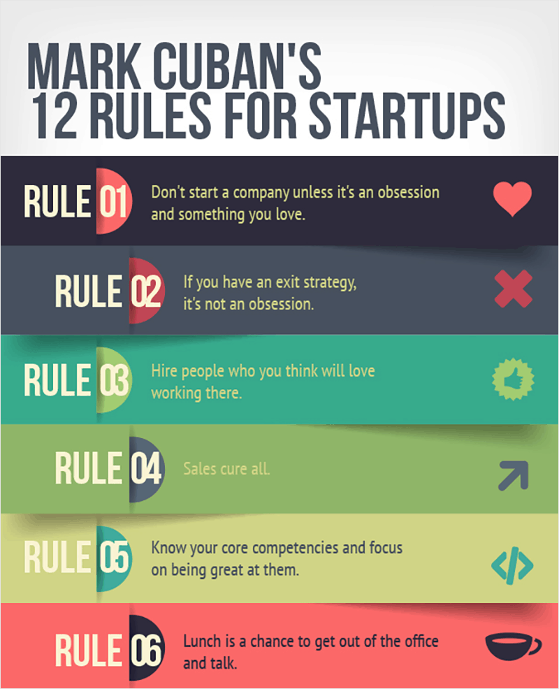
· Comparing similar services or products, as well as ideas

Choose the best topic
The topic of your infographic plays a crucial role in its success. If it is too broad, it won’t work on the targeted audience and you might have trouble narrowing down the information to include in it. As a result, it will be messy, won’t contain any key information, and people won’t be willing to share it.
This is why your infographic topic should be clear and to the point. Since you need to present only bite-sized information, you need a very specific topic that allows you to narrow things down into 100 words.
Pick a complementary color scheme
When it comes to visual content, colors are a huge part of its success with the audience. People see the colors right away. Very often, the wrong choice of colors can push people away or make the content hard to follow.
The color scheme you choose for your infographic is a very important step. Pick colors and shades that complement each other, make sure to use a readable font in the right color, and maybe even play with your choices to achieve an emphasis on the most important information. Visme has a nice educational post that will help you choose the colors for your creation.
Follow a logical timeline
If the information is not well-organized, your infographic will be messy – nothing else. People need to make sense of it as soon as possible. The goal of using such a medium is to make the information clear right away, as well as easy to digest. You’ve failed its biggest purpose if you don’t create a flow.
This is why infographics usually consist of step-by-step processes, numbered information, chronological order of data, etc. In other words, your creation should be a visual storyline that makes sense to all.
Pick the right font
When you have the background, the images, and other features to include, as well as the content, it is time to pick the font. This is another piece of the puzzle that can make or break your creation.
The goal of an infographic is to provide an engaging and presentable way of sharing information. The term ‘information’ is key here. It means that your goal, once again, is to share some data with the readers. This is why you need to make that information readable, easy to process and scan.
For infographics, it’s best to avoid the fancy, complex fonts that are harder to read. Check some successful examples – they all use simple fonts that look professional and scream ‘’clarity’’.
Make use of the white space
Infographics are basically photos filled with data in the form of graphics, images, and content. Even so, your creation should not be cramped with visual elements. Nothing will stand out if you place everything in one corner or make the image bulky.
White space should be used to separate different points, sections, and graphical elements. If there’s little white space, that means that you need to reduce the wording and eliminate some visual elements. Naturally, the term ”white space” is just a term for spots in your infographic that are content and visual elements – free. It doesn’t have to be white.
Remember to brand your design
The main reason why you’re creating an infographic for social media is to educate the audience and engage them. Your goals are to attract more people, make them take action, educate them about your product, and prompt them to share the infographic.
If you want to help people discover your products, services, as well as your brand, you need to brand the infographic, too. This will help you gain visibility and links on other websites and social profiles. Even if the person seeing your infographic already knows about your brand and follows you on social media, chances are that the people who see their share won’t know this.
Branding includes everything from adding your logo to some company information, to choose unique patterns for brand colors and fonts. And of course, if your goal is to bring people to your site or company, include some contact information at the end.
Final thoughts on social media infographics
Social media users often just scroll through their news feed without paying much attention to what’s there. If you want to attract their attention and engage them, you need something that stands out. A good social media infographic can certainly achieve this. Infographics are created to make the content more bite-sized, easier to understand, and memorable. They are also used to transform generic, dull articles that don’t work into visually engaging content. Introducing some quality infographics into your marketing strategy makes for one of the smartest moves these days.

