In the fast-paced, visually driven world of social media, no platform stands out quite like Instagram. As a haven for visually appealing and engaging content, Instagram has become an indispensable tool in the world of digital marketing.
If you’re wondering how to make money on Instagram, this platform offers a wealth of opportunities for monetizing your creativity and building a profitable online presence.
However, to transform casual scrollers into active customers, your Instagram profile must include an appealing and substantial element – a powerful Instagram landing page.
This article delves into the art of crafting an impactful Instagram landing page, offering useful tips and strategies to convert your Insta audience into potential leads and customers.
Clear, compelling headline
The magic of a highly effective Instagram landing page begins with one crucial element, a clear and compelling headline. This is your first point of contact with the user, and it needs to instantly grab attention, stimulate curiosity, and encapsulate the value your page offers. Here’s how:
To establish clarity, you must keep your headline direct and simple. You could try using an AI copywriting tool like ChatGPT to get you started. Use readable language and try to eliminate industry jargon or complex words. Your audience should be able to understand your message in an instant.

A compelling headline, on the other hand, holds the power to evoke emotions or thoughts. Engage your audience by demonstrating the benefit they will get by staying on your page or by making a bold promise.
Remember, your headline needs to sync with your brand’s voice. If humor aligns with your brand, don’t be afraid to implement it. If your brand is more formal, lean on professionalism and straightforwardness.
By intertwining clarity with compellingness, your headline will definitely strike a chord with your visitors, encouraging them to explore more and engage with your Instagram landing page.
High-quality images
The power of high-quality images on your Instagram landing page cannot be understated. As a highly visual platform, Instagram favors striking, crisp, and vivid images that immediately draw attention and communicate your brand’s story at a glance.
High-quality images make your affiliate landing page aesthetically pleasing and more likely to make a strong first impression. To optimize the use of images, here are a few things you need to bear in mind.

First, ensure that the images you use are of high resolution and clear. This is essential because blurry or pixelated images can detract from your message and could potentially harm your credibility.
Next, consider the composition of your images. They should be well-framed, well-lit, and should follow the basic principles of photography and design.
Lastly, keep in mind that your images should align with your brand’s tone, color scheme, and overall visual strategy. They should be congruent with your brand message and post content.
Creating a visual spectacle through high-quality images isn’t just for show—it’s an essential aspect of your Instagram landing page that can significantly impact user engagement and conversion rates. Your images are essentially the visual representation of your brand and the first point of interaction visitors have with you, so make sure they’re impactful and engaging. Customized Canvas Photo Prints and Wall Art can also serve as an effective way to enhance your brand’s visual narrative, offering a personal touch that resonates with your audience.
In a crowded industry where competition is fierce like in travel industry, food and beverages, Airbnb, and fashion, investing in top-notch images for your Instagram landing page can be a game-changer, helping you stand out and leave a lasting impact on your audience.
Call-to-Action (CTA)
A call-to-action (CTA) serves as a guidepost that directs your audience toward the next step they should take on your Instagram landing page. It’s a powerful tool that if used wisely, can significantly boost conversions and engagement.
Creating an effective CTA involves a combination of compelling language and strategic design. Begin by clearly defining what action you want your visitors to take. This could range from signing up for a newsletter, scheduling an appointment, starting a free trial, or checking out your latest products for easy accounting software.
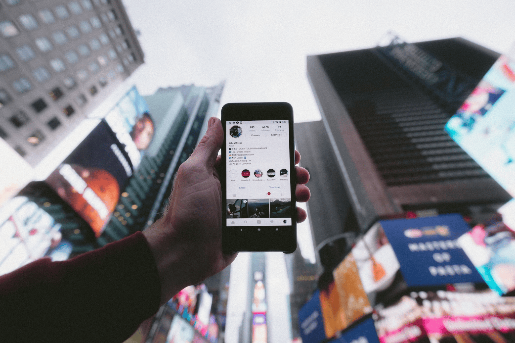
Next, use actionable and persuasive language in your CTA. Instead of generic phrases like “Click Here,” try using more incentivizing language like “Start Your Free Trial Today” or “Get Exclusive Access Now.
In terms of design, your CTA button or link needs to be visually striking and easy to spot. Use contrasting colors to make it stand out from the rest of your page. Additionally, place it in a prominent position where it is most likely to gain attention.
Lastly, experimentation is key. Test different CTA copies, colors, and placements to identify what works best for your audience. Above all, ensure the action you’re asking visitors to perform is straightforward, valuable, and beneficial to them.
Remember, your CTA is not just a decoration—it’s a key component of your Instagram landing page that initiates user action. So, pour your creativity and strategic thinking into crafting a CTA that compels visitors to move beyond browsing, and takes the next step towards making a purchase or becoming a lead for your business.
Mobile optimization
Since Instagram is primarily a mobile platform, ensuring that your landing page is fully optimized for mobile users is almost non-negotiable. Mobile optimization enhances user experience, making navigation smoother and engagement more likely.
Your first step is to ensure that the page loads quickly on mobile devices. A slow-loading page can lead to high bounce rates as users are likely to lose patience and exit your page. Thus, optimizing the loading speed is crucial for retaining your audience’s attention.

Next, you need to factor in the design elements. Everything from the size of your text to the visibility of your call-to-action needs to be conducive to a smaller screen. The layout should be clean and simple without requiring users to zoom in or scroll sideways to view your content.
Furthermore, consider the placement of your key information. On a smaller screen, the information that’s visible without scrolling (also referred to as ‘above the fold’) becomes immensely important. Your headline, CTA and key selling points should ideally be placed here. Later, as you will use backlink building tools for SEO, send email newsletters, or implement other marketing campaigns, your landing page will look accurate and will provide the necessary information.
Lastly, always test your landing page on various mobile devices and screen resolutions to ensure that it looks good and functions well regardless of the device used.
By ensuring mobile optimization for your Instagram landing page, you greatly enhance the chances of holding your visitor’s attention, thereby increasing the likelihood of conversions and engagement. In a mobile-first world, a well-optimized page will inevitably lead to better user experience and ultimately help you accomplish your business goals and make money on Instagram.
Integration with other social media
The integration of your Instagram landing page with other social media platforms is a savvy strategy to amplify your reach and consolidate your online presence. This not only helps drive more traffic but also enables a seamless user experience across all platforms.
The easiest way to link your Instagram landing page to other social media profiles is by including icons or ‘follow us’ buttons on the landing page. This makes it effortless for your visitors to connect with you on platforms such as Facebook, Twitter, LinkedIn, and Pinterest.
Another strategy involves using cross-promotion. You can share teaser posts about your Instagram content on your other social media platforms, enticing your followers to check out your Instagram page.
Don’t forget to seamlessly integrate messaging across all platforms for consistency. The voice, tone, and messaging should be uniform ensuring your brand remains recognizable and cohesive, regardless of the platform.
Lastly, you can consider using landing page tools that allow multiple destinations. For instance, link services like involve.me allow you to use one link to house all your other important links, ensuring your audience can find your entire online presence quickly and easily.
Integrating your Instagram landing page with other social media platforms allows you to maximize your online marketing potential and open up new avenues for engagement and audience growth.
A/B Test
A/B testing, also known as split testing, involves creating two versions of your Instagram landing page with subtle changes to one specific element, to see which one performs better.
First, pinpoint what element you want to test. You might choose to alter the headline, the image, the call-to-action, color schemes, or button placement. Remember, only test one factor at a time to ensure accurate data interpretation – if you adjust multiple aspects simultaneously, you wouldn’t know which change led to a different result.

Next, divide your audience into two random groups: one will see version ‘A’ of your landing page, the other group will interact with version ‘B.
After a certain amount of time or number of visitors, measure the engagement with each version. You can use tools – Google Analytics, for example – to analyze metrics like click-through rates, time spent on page, conversion rates, or any other relevant measure that aligns with your goals.
The version that leads to better engagement, based on your specific objectives, is the one you should keep and use.
A/B testing is a fantastic and scientific approach to refining your Instagram landing page. It helps you understand which elements resonate more with your audience, eventually leading to more effective landing pages and better conversion rates.
Don’t Overdo It
While it’s crucial to make your Instagram landing page impactful and attractive, there’s a fine line between doing just enough and going overboard. Overcomplicating your page can have the opposite effect of what you intend, driving visitors away instead of drawing them in.
Firstly, avoid crowding your page with too much information or too many elements. Cluttered pages tend to confuse visitors and could lead to them bouncing off your page. Simplicity and clarity should be your guiding principles.
Secondly, keep your content succinct. Yes, every piece of information might seem important, but overwhelming your visitor with excessive content can be counter-productive. Focus on your key message, and ensure it’s easily comprehensible. You can consider using generative AI to create targeted content if you’re running low on ideas or dealing with a tight deadline.

Next, ensure your design isn’t overly flamboyant. Too many colors or flashy animations can distract visitors from your core message or call to action. A clean design with a clear hierarchy of information is more likely to guide your visitors effectively through your page.
Last but not least, don’t make unrealistic claims. Visitors are savvy, and they can sense when things seem too good to be true. Maintain authenticity and transparency in your content. Try to use as much user-generated content as possible. There are UGC tools out there to help you with this.
Not overdoing your Instagram landing page isn’t about backing off your creativity. Instead, it’s about focusing on your customer’s experience and delivering your core message effectively.
By providing a clear, clean, and focused page, you can create an inviting and engaging experience for your visitors, thereby encouraging them to take the desired action. And remember, sometimes less really is more.
Select a Builder
Choosing the right landing page builder for your Instagram page can simplify the design process and contribute to your page’s success. But how do you select the right one amongst the sea of options available?
When picking your landing page builder, your first consideration should be ease of use. Find a builder that offers intuitive and user-friendly interfaces, where no extensive tech know-how is required.
Next, check whether the builder offers mobile-responsive design. Given Instagram’s mobile-centric nature, making sure your landing page looks great on small screens is crucial.

Thirdly, consider the customization options the builder offers. While templates are helpful, having the freedom to customize the layout, colors, fonts, and more will help you maintain brand consistency across your digital assets.
Marketing features like SEO options, A/B testing capabilities, and analytics tools are valuable add-ons that you should check for. These help you optimize your landing page for better visibility, testing, and improving based on the gathered performance data.
Lastly, ensure that the builder aligns with your budget. Be sure to check whether the builder fits your budget without compromising on essential features.
Choosing the right landing page builder is an important project. But by keeping these factors in mind, you can find a tool that fits your needs, allows for creativity, and ultimately leads to a successful and impactful Instagram landing page. While the perfect landing page builder may vary for each business, the goal is the same– to create a high-converting, compelling, and user-friendly landing page that drives your audience toward your desired action. In many instances, people could come across your brand page on Instagram through your website. Hence, it is important to have a good domain rating and a good presence to not miss on this organic traffic.
Final Thoughts on an Instagram Landing Page
Crafting an impactful Instagram landing page is an art that involves a blend of creative and strategic thinking and the right Instagram tools.
From compelling headlines and high-quality images to persuasive call-to-actions and seamless mobile optimization, each element has a crucial role to play in captivating your audience and driving conversions.
As we see an increasing interplay between different social platforms, integrating your Instagram landing page with other social media becomes a key strategy in amplifying your reach and brand consistency.
