
Imagine someone walking past you right now in an outfit entirely composed of matching colors – the same color of shirt, pants, shoes, and hat. Chances are you wouldn’t stop staring at them.
If their color symmetry comes off as appealing, you’re likely going to compliment them for it. But, if it has a funny side to it, you’re definitely going to laugh out loud (LOL).
That’s the thing with symmetrical sights – they’re hard to miss or ignore.
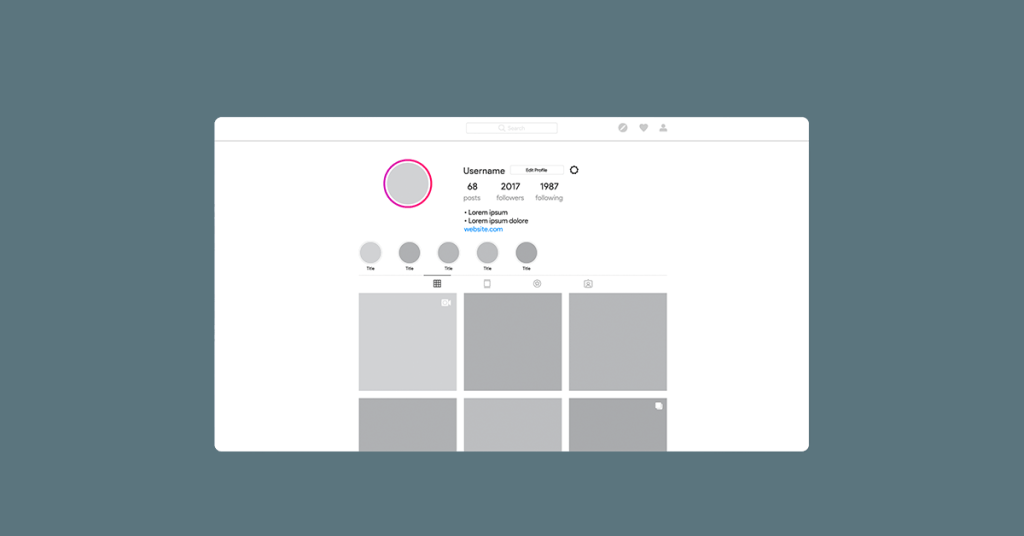
The same idea extends to Instagram grid layouts. People design symmetrical IG layouts to appeal to their audience because they know viewers will be captivated by them.
Before coming to this post, you’ve probably seen someone’s grid layout and fell in love with it. And now, you’re surely wondering how to arrange yours the same way.
Well, the grid layout is such a great idea, and it has a lot of benefits. In this post, we’re going to be showing you ways to find Instagram grid ideas and design your own jaw-dropping layout. Later, we’ll also point out the reasons to use Instagram grid layouts on your pages.
8 Ways to Design Your Instagram Grid Layout
1. Follow a similar color pattern
The most common style of grid layout you’ll find on Instagram is a style based around a similar color theme. In addition to being one of the simplest ways of designing a uniform-looking page, it also doesn’t involve too many fancy arrangements.
Just pick a color palette (e.g., red like Coca-Cola or green like Shopify) and make sure your posts include that shade. Of course, some posts will have higher contrasts than others, but the point is for everything to look almost the same, color-wise.
In this fashion, when someone comes to your page, the uniform color theme will quickly strike them, leaving a lasting impression in their minds.
Shopify’s official page is a great example of this. Although the content of each post varies, the unique green palette adopted for each case gives the Instagram page design an eco-friendly vibe. Viewed together, the entire collection looks like a matching set rather than a collection of individual posts.

Another example of the matching color set is the grid layout on Aleksandrazee. Here, the color palette is chocolate, and the entire grid layout reflects that, giving off a choco vibe.

2. Follow a checkerboard approach
Another common grid style that’s popular on IG is the checkerboard design. Here, posts with two distinct patterns are published in an alternating format to create a checkerboard appearance.
For example, we could have an alternating collection of photography and text-based images, wherein one post is a photo/image, the next is text, and the one after is a photo/image.
In most cases, photos-and-text checkerboards are what you’ll mostly find on many people’s accounts. But this isn’t the only way of implementing a checkerboard grid styling on your page. A few more of the many exciting ideas include alternating photos and videos, close-up snapshots and landscapes, or infographics (using an infographic maker) and photos.

Some people even get creative by alternating colors. For example, the first post could be red, while the next would be blue, and then red, and so on.

In short, there’s no fixed approach to creating a checkerboard grid design. Just think of two unique content styles your posts could alternate between. And remember, consistency is key. What is more, it’s always a good idea to rely on an Instagram grid maker to upload your visuals and take a look at your feed before publishing content. This way, you can ensure that your feed is well-planned and eye-catching.
3. Pull off some row magic
What if your grid had a uniform theme spread across its rows? Imagine each individual row carrying a similar color palette, text style, or image background.
That would be captivating, no doubt.
We see @gregorygiepel pull this off regularly. The only challenge with this approach is you have to post the entire row’s content (the three posts) in one go. Otherwise, you risk messing up the symmetry.
The beauty of this grid layout is that it allows you to play with different ideas. For example, you can make the three posts in a row form a bigger picture.


4. Pull off some vertical magic
In a similar vein to the row arrangement, we can create vertical arrangements on the grid, too. In the vertical orientation, posts are arranged to fit together in a column, as shown in the example below..

5. Vertical and horizontal combo
Usually, when you need to tell a longer, bigger story, you’ll need more than a single row or a single column. In that case, combining rows and columns becomes inevitable, which brings us to the row-column magic combination.
In this grid format, posts are published in such a way that they add up to one large picture. An example is shown below.

A good example of when you can use the kind of Instagram page layout grid above would be when you’re trying to run a promotional campaign. For instance, say you’re giving out free promo codes as rewards for following your page, you can use the row+column layout to make this campaign hard to miss in the feed gallery.
6. Create a vintage style with white borders
Some Instagrammers apply white border filters to all their posts.
Why? Because it helps them stand out. Indeed, a white-bordered grid layout ensures all your photos -give off a vintage style. Plus, it also provides the sort of symmetry and uniformity you want out of implementing a grid layout design on your page.
A good example of this can be found on the @lady.austin page.

In a way, all the pictures above seem demarcated by white spacing. But it’s not spacing; it’s actually the white borders at work.
Please note that your border theme doesn’t always have to be white. You can have borders in all sorts of different colors and shades.
7. Puzzling puzzle style
Engagement is key on Instagram. What better way is there to engage your audience than with puzzles in your gallery layout?
Setting up your grid layout in the form of square puzzles is a nice trick to pull off when you want to run a contest, giveaway, or advert campaign. Since people may ignore or miss the message if you publish it in individual posts, puzzles help you create one big, interconnected image out of all the squares.
Viewed together, viewers can make sense of the pieces and possibly even win a reward for their effort or at least understand the message you’re trying to communicate.

8. Follow the phone gallery-like theme
If I were to get a hold of your phone right now and open your image gallery, I bet I’d find at least one photograph that has plenty of variants. Same outfit, but different poses. Same pose, but different angles. That is the way many of us take pictures on our phones.
We can create a similar design style on our Instagram account, too. Such a grid layout will contain one row of three similar photos with different angles. If you’re a brand owner, you could use this kind of layout to showcase different angles of the same product or different aspects of the same process. If you’re a lifestyle or fashion influencer, you could use this layout to showcase different views of the same outfits.

The power of telling a story with your grid layout
Creating a grid layout isn’t just about using matching colors or creating something aesthetically pleasing. Your layout has to get a unique message across. For example, on Burna Boy’s page, the grid layout is designed in such a way that event dates are kept as the third post on every row. In many cases, the first two posts in each row are always snapshots or videos from the event at the end of the row. So, to see an overview of what went down in the event advertised on the third post, you simply have to view the two preceding posts.
Can you imagine such artistry? Indeed, you, too, can bring a sense of uniformity to your page by arranging your posts in a similar fashion.
By and large, don’t just place posts of matching colors together. Ensure there’s a message being relayed by the collection of threes.
Hot Tip:
If you need help organizing your posts in the formats described above, use a flowchart creator to sort your content ideas first. That way, you can see which ideas fit together to tell certain stories.
Why your Instagram grid layout design is important
1. A way to captivate first-time viewers
When someone visits your page for the first time, your grid is an opportunity to win their heart forever. Everybody is used to seeing unorganized grid arrangements. When you stumble upon a neatly-arranged grid like this one from Bossbabe.inc, you fall in love immediately. In a way, it feels like you’re looking into the depths of the brand’s soul.

Rather than viewing each post as an individual entity, your brain suddenly forms an overall impression of the entire layout, giving you a broader picture of what’s going on.
2. A bird-eye view of posting culture
As you’ve seen above, there are different ways of designing your grid layout. But, in each case, you can see that the design helps viewers understand the brand’s posting culture. For example, popular music artist Burna Boy’s grid dedicates a full column to event dates.

If you’re a first-time visitor on this artist’s page and you want to check out their tour dates, you don’t have to scramble around the entire page. The grid layout has already given you a bird-eye view of what you’re looking for.
3. A good overview of what your brand is about
A picture is worth a thousand words, but a well-designed grid layout is worth even more. Save yourself the stress of explaining what you do to your audience by letting your grid layout do the talking.
A well-curated layout can help viewers understand what a brand is all about without having to search throughout the page. From their first look at the grid layout, they can get a sense of the brand’s body of work.
For example, let’s say you run a cake-baking business. An Instagram grid layout can give first-time page visitors a glimpse of the type and quality of cakes you make. They don’t need to scroll and scroll to affirm whether you make nice cakes or not. The lined-up rows of three posts form a bigger picture providing viewers with a peek at your best work.
4. A way to bring your brand identity to Instagram
What color is your brand logo? What design is it? Do you have a unique color pattern you follow? Is it on your packaging materials, office building, staff bus, and the product itself?
If so, your grid layout is a great way to bring this same theme to your Instagram. Neil Patel is a digital marketer whose website and blog pages always have an orange color theme. PayPal is a blue-themed brand. Even though they don’t have a grid layout on Instagram, all of their posts carry a blue theme.
Coca-Cola is known for its red color branding. Everywhere you go – including Instagram – you’ll find the same color theme for the brand. As you can see below, the brand adopts a red color combo grid layout.

As you can see, maintaining your brand color with a creative Instagram grid layout is a way to showcase consistency across your brand. And that will surely show your customers that they’re in the right place, putting their minds at rest.
5. A way to impress your audience
Unless you run your ’Gram for the fun of it, you definitely need to pay attention to awesome grid designs. People are so used to regular lineups of posts that it’s becoming boring already. Let your page captivate and fascinate in a unique way. Let people come in and enjoy every single second spent on your profile.
The only way to ensure that is with a stylish grid layout design.
Check out this charming example from @the_oa:

6. Ensure your audience views all of your posts
To view a post on someone’s Instagram page, you first have to click on it. After that, you have to keep scrolling downwards to view other posts.
Many times, people would like to view all of your posts, but they don’t have the time to keep scrolling. So, what they do is they view a few posts, press the back button, and then continue to scroll on the main page until they find another post that looks striking from afar. In the process of going back and forth from your page, it’s inevitable that some posts will go unnoticed by viewers.
A grid layout is a way to prevent this. When grid layouts are lined up in rows of three, each post suddenly forms part of a bigger picture. If you’re using WordPress, you can leverage DiviFlash, which offers Instagram feed gallery and carousel features that ensure a visually appealing way to display your content. This setup guarantees that viewers will be captivated by the bigger picture and are more likely to engage with individual posts.
7. A way to pass your message across
In #6, we pointed out that grid layouts help to prevent viewers from scrolling past posts. They are also a great way to ensure none of your messages go unnoticed. If you have a message to pass along, grid layouts help to ensure viewers find the message exactly when you need them to.
Say you have a giveaway message, a contest announcement, or an Instagram promo campaign advert; using a grid layout to get your message across is a sure way to ensure nobody misses the news.
Conclusion
We cannot overstate the significance of grid layouts. They are indeed one of the most unique ways of making a page stand out on Instagram. If you’re serious about growing your Instagram page organically, this is one of the things you need to start doing. It will attract more followers and hold onto the ones you already have.