
Numbers, statistics, and other data can add some serious value to your content. They help to support claims, simplify convoluted topics, and engage your audience. The trick is knowing how to make that data engaging and easy to understand.
That’s why you need to employ data visualization. Colorful eye-catching graphics, such as graphs, charts and infographics, are the unequivocal champions of transforming raw data into a compelling story and aesthetically pleasing content.
Read on to learn the impact data visualization can have on your content marketing and how to start incorporating it into your strategy.
The role of visuals in conveying complex information
If your business involves complex ideas that your customers need to comprehend, then use data visualization.
Breaking down complicated topics
Suppose yours is a business that provides an IT solution that helps businesses gain a clear understanding of the inner workings of their organization, from people to processes. You want to convey the enterprise architecture benefits to your audience, demonstrating how changes in one area can have a positive impact across the system.
This is information that isn’t particularly easy to comprehend without a visual aid. Using data visualization here can convey this information in a digestible format and showcase the efficacy of your product.
Enhancing content value
Including data visualization is one of the best ways to up your content marketing game. Whatever the message you’re trying to get across in your content, words and numbers can only get you so far.
Visualization doesn’t just make your blogs and social media posts attractive to look at, they also strengthen your point and demonstrate what you’re offering in the most attention-grabbing way.

Free to use image from Unsplash
How visuals impact audience engagement
As the saying goes, a picture is worth a thousand words. Putting your data into visual form allows it to be processed much faster than if it is being read or heard. Remember, most people consume huge amounts of content every day.
How many social media posts does the average person scroll through? How many articles are they skim-reading? Few people have much time to spend absorbing a lot of information, which is why visuals are essential if you want to stand out amongst the crowd, keep people’s attention, and expand customer engagement.
Tailoring visualization strategy with audience analysis
Getting to know your audience will help you to target your data visualization effectively.
Identifying pain points, goals, and interests
Invest in audience research to get clear insight into what your audience wants and what problems they’re looking to solve. Say an e-commerce company uses online phone systems to handle their customer communication.
Data extracted from this system indicates that peak calling times are between five and six o’clock in the evening. They might then schedule social media posts for this time, incorporating data visuals, to engage customers when they’re at their most active.

Free to use image from Unsplash
Adapting complexity to audience comprehension
You should have a clear idea of who your target audience are and how much they are likely to know about a topic. The complexity of visuals should then be carefully tailored to match their level of understanding and keep them jargon-free.
The most important thing to bear in mind with visuals is that they should offer further clarity, and not present a comprehension issue all on their own. If you prioritize being concise and relatable, you can feel confident that people who consume your content will come away with a deeper understanding of your message.
Personalization for greater relevance
Just like with any kind of content marketing, data visuals are more powerful when they’re personal.
Crafting visuals aligned with audience needs
Visual storytelling is at its most influential when you understand what is going to spark a reaction in your audience; you can then use this as a starting point to create your visuals. Let’s take the example of a fitness app. The target market for this audience will be people who are health-conscious or want to get fitter.
A smart content strategy would be to use infographics or social media posts that shine a spotlight on user success stories, fitness journeys, and achievements. This data, presented in a visually striking way, will inspire potential users and demonstrate how well the app works. This is just one example, but the concept is universal.
Employing metaphors and contextualization
These are another couple of tools to help guide your audience through your data. Metaphors provide a relatable image that is easy to understand. For instance, a cloud storage device could be represented as a virtual filing cabinet. The message is clear: this product will organize your files and keep them safe.
Contextualization, on the other hand, sheds a different light on the data, giving it more meaning. Imagine visualizing financial data within the context of a stock market timeline. This will deliver a comprehensive view of how different factors influence investment outcomes.

Free to use image from Unsplash
Exploring different data visualization types
Let’s break down the different kinds of data visualization and what each one is best suited for.
- Bar graphs: Super straightforward, bar graphs are ideal for comparing quantities across a range of categories.
- Infographics: A wonderfully versatile visual tool, employ infographics when you need to combine text and images to convey complicated information
- Pie charts: Want to visualize proportions and percentages as part of a whole? Use the trusty pie chart.
- Maps: When you need to present geographical information, a map is your go-to solution for a spatial understanding of your data.
- Heat maps: These focus on visualizing data density and use color to depict areas of concentration or intensity.
- Scatter plots: If you need to illustrate the correlation between two variables, scatter plots are on hand to showcase patterns and trends.
- Tables: Numerical data can be displayed in table form with exceptional precision and clarity.
Matching formats to data and storytelling goals
Time to get into the finer details of how to pick the right format for various data sets.
Selecting appropriate visualization for different data sets
Some visualizations work better for specific kinds of data than others. Choosing the right format can make a big difference in making sure your intended meaning is clearly communicated.
For example, if you want to illustrate business capabilities, bar graphs would undoubtedly be your best choice for comparing quantities, while scatter plots would excel in showcasing relationships. If in doubt, try different methods and assess which looks best for your purpose.
Pairing up multiple visual elements for comprehensive storytelling
There may be times when just one visualization isn’t enough. Using multiple visuals is completely acceptable, but make sure they complement each other and don’t confuse the matter.
Suppose you’re illustrating market trends with a chart, but the data requires the context of regional variations. You could use a geographical map to depict this information and add depth to your content, giving your audience a holistic understanding of the data.

Free to use image from Unsplash
Basic design principles for data visualization
Even if you won’t be creating the visuals yourself, it’s good to understand the theory of good visualization design.
Consistent use of colors and fonts
Brand image and consistency should always be a priority in content marketing, and that includes your data visualizations. It’s not just about maintaining a professional and memorable online presence, it also helps to aid data comprehension.
Adopt a cohesive color palette and always use the same fonts and shape style. The colors should align with those used in your branding and evoke the desired emotion, e.g., if you’re showing positive financial figures, use green.
Organized layout for better user experience
Keeping your visuals in good order will create a superior experience for your intended audience.
White space, balance, and alignment
Nobody likes a cluttered room and a cluttered visual is equally as unappealing. That’s why white space is your friend, giving your data visualizations a pleasantly clean aesthetic. To enhance this even further, pay close attention to balance and alignment.
Balance is about equally distributing your visual elements, so they’re not all bunched up or on one side. Alignment means placing your visuals in strategic places to reinforce certain points and create the most satisfying structure.

Free to use image from Unsplash
Importance of interactivity in data visualization
Whenever you have the opportunity, make your data visualizations interactive.
Capturing user interest with interactive elements
Achieving and then maintaining your audience’s interest is the main goal and there’s no better way to do that than with some interactive elements. These not only keep the user on the page longer but also help them to learn more from your data.
One example of this would be a dynamic infographic that reveals more in-depth information when you click on different parts. Another would be an interactive chart that allows you to examine specific data points. This level of participation will make your visuals far more memorable.
Enhancing user experience through interaction
If you’re going to make your visuals interactive, above all else, make sure they’re user-friendly. Every interaction should be intuitive so your audience can explore the data with ease.
Clarity and simplicity should be your guiding lights so that your visuals contribute to an overall better user experience, one that engages your audience and presents a slick and professional image of your brand.
How to choose the right data visualization tool
The right data visualization tool will help you create impressive graphs and charts to support your multi-channel marketing strategy. Look for one that is easy to use and has customization features that will allow you to create visuals that integrate with your brand.
Other elements to consider are your project objectives, compatibility with any existing systems (particularly data sources), and features that facilitate collaboration. There are lots of options available, including some free tools if your budget is limited.

Free to use image from Unsplash
Importance of SEO optimization for visual content
Visual content optimization for search engines is how you make sure your carefully created designs are discoverable. You can do this by including strategic keywords within the metadata, such as image captions and alt text.
It is also of utmost importance that your content be optimized to display on different devices and platforms so that whether users discover it on their phone or their tablet, they get a seamless experience. SEO-optimized visual content can improve visibility and help your content reach a broader audience.
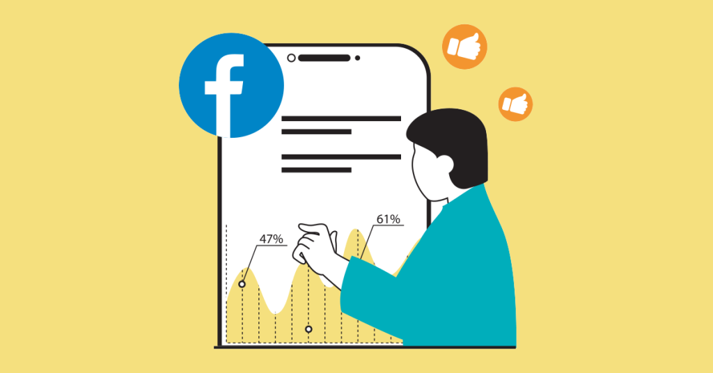
Harnessing social media for visual content reach
If you want people to see your amazing visuals, you need to get them on social media.
Utilizing hashtags, mentions, and engaging descriptions
Selecting the most suitable platform for your brand and target audience is a key component of improving customer experience. Present visuals with lively descriptions while employing relevant hashtags to boost visibility.
The importance of social media marketing cannot be overstated and the use of data visualization is a useful tool for increasing audience engagement, producing content virality, and generating business growth.
Encouraging sharing and user interaction
Focus on ensuring your content is as shareable as possible to further extend its reach. Responding to comments and questions is a good way to start — if someone shares your visual content, always acknowledge it.
Make sure that your content can be shared easily by including social sharing buttons (if it’s not already on social media) or checking your social settings. In some cases, it may be appropriate to run a contest that someone can enter simply by sharing your content, which acts as a great incentive.

Free to use image from Unsplash
Improve your content marketing with data visualization
We’re in an age of data and most businesses are sitting on a gold mine of information. Taking advantage of that resource takes many forms, but data visualization is something every company should be using to its full effect.
Data visuals work wonders for audience engagement, convey complicated information in the most easy-to-digest format, and improve the overall quality of your content. If you haven’t started using data visualization in your content marketing efforts yet, use the tips above to start today and discover for yourself just how effective it can be.