Due to the fact that humanity is completely involved in the online realm, more individuals are utilizing social media. Without a doubt, many agencies are here to provide you with incredible social media design tips. However, it is also possible to face an obstacle.
Marketers know that customers are actively utilizing social media, and it motivates them to revive their promo campaigns. You know what we are going to say next. There is also a twist.
As a result, there is more rivalry for attention. Social media companies and digital marketers must put in more effort to maintain the same exposure throughout the year. Luckily, engaging visuals may elevate posts and assist companies in standing out from the mass of other content.
So, what about your social media design strategy? Does it go unnoticed? Perhaps it is better to upgrade your social media design with these tips.
What does it take to make an effective profile with eye-catching visuals? Check out these suggestions for enticing social media design that sells.
Pick the appropriate color scheme.
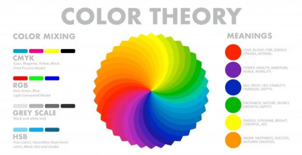
First and foremost, your social media postings must be visually appealing. So, the proper color combination is critical. You do not want to employ colors that will make your audience take another road and make them unfollow you on social media.
Each color conveys a message or a mood. Choose a color that accurately portrays the personality of your brand. For example, if you want your brand to appear reputable, you may choose the color blue.
Likewise, you may reflect your lively side by using hues like orange or yellow. Whatever color you select, make sure not to overuse it since it may mislead your customers about the brand’s ideas and views.
Source: https://logopoppin.com/blog/color-combinations/
Opt for the appropriate font and text.
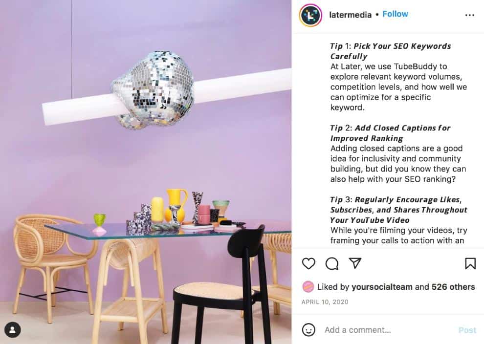
The next critical step is to take advantage of the appropriate font and text. A proper and modern style may improve your social media design while conveying an idea to your viewers.
Since visuals may be a mix of images and text, it is crucial to strike a healthy balance between the two. Long and intricate text in images may turn off your viewers. As a result, the objective is to express your message in a brief and clear text to communicate your point successfully. This form of content obtains greater interaction and is likely to generate more social shares. Also, consider collaborating with agencies that offer graphic design services to enhance the visual appeal and effectiveness of your content.
Source: https://vistasocial.com/insights/how-to-find-and-customize-rich-text-fonts-on-social-media/
Craft attention-grabbing thumbnails for your videos.
When you share a video on social media, a thumbnail is frequently the first frame of that video. If you do not know, the thumbnail is a cover picture that the site uses to show your content. However, a video’s opening frame may not be the most thrilling reflection of your content.
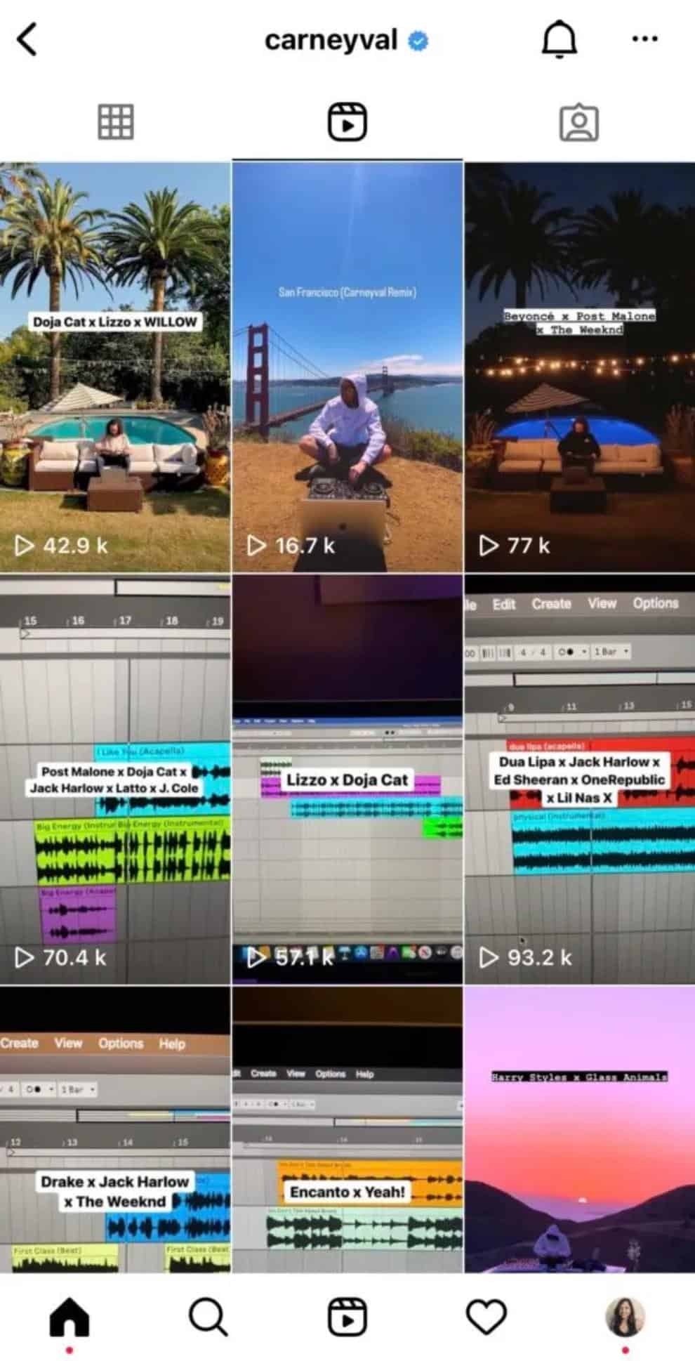
Before you publish videos (on IG Reels, TikTok, Youtube, etc.), select a thumbnail individually. It is better to choose a picture that you believe is aesthetically pleasing or delivers the most worthwhile material.
For example, Carneyval is a musician that uses his reels to publish remixes of popular songs. His reel covers include information about the songs he has remixed in that reel. In other words, they highlight what to expect from the video and provide a preview of what the reel is about/
Source: https://garimashares.com/how-to-change-instagram-reel-cover/
Recognize image copyright.
It is not always effortless to find suitable photographs, particularly when it comes to copyright. However, it is critical to use image copyright, particularly given the devastating effects of misuse.
When utilizing stock images, templates, and graphics, make sure you read the tiny print. If something is questionable, contact the image’s author or the site for clarification.
The same is true for contracting and licensing. When establishing contracts with artists, ensure that you specify where you want to utilize the work, who holds the rights to it, and so on.
When it is necessary (which is often), give credit. It is also applicable if you want to post or republish user-generated content.
For instance, the official Instagram account of Disney World frequently includes photos by other users. It never forgets to thank the original poster in the description.

Source: https://www.instagram.com/waltdisneyworld
Do not forget to add your logo.
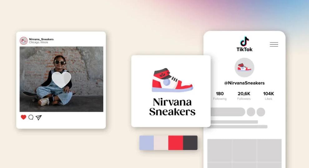
Brand awareness refers to your client’s connection with your product or service. In this case, a logo plays an important role in developing that recognition.
Your logo (if properly developed) will become the image of your brand. It will be the symbol that will help people build associations with your firm. In addition to this, it will assist you in establishing confidence, respect, and influence in terms of your intended audience. By incorporating the logo into your social media accounts and posts, you will increase your following and expand your reach every time someone publishes your content.
Source: https://www.tailorbrands.com/blog/using-logo-on-social-media
Use contrast in terms of shapes, colors, and sizes.
You may adjust components by generating contrast between them. As a consequence, one will jump out or be displayed more strongly than the others. It is a terrific method to improve the presentation of your social media photographs.
In the lack of contrast, your design may feel flat and uninspired. Anyway, keep in mind that too much contrast may result in nothing but chaos.
When it comes to social media design, you can produce contrast by utilizing colors to play off the dark with the bright (black lettering on a white background). It will make the text more aesthetically appealing and legible. Aside from employing symmetrical forms to generate contrast, use organic shapes to reveal asymmetry while emphasizing uniformity.
Making specific design components larger or smaller than others is another great approach to bring contrast to your social media design. 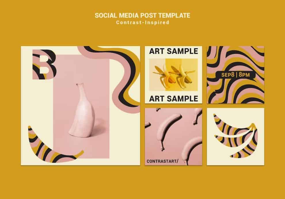
Source: https://www.freepik.com/free-psd/contrast-inspired-art-expo-social-media-posts_15680558.htm
Remember that every platform is special.
Remember that every platform is unique. Knowing what works well with different platforms in advance will not only assist you aesthetically with your viewers. It will also make staff more straightforward for you in the long term. Realizing what users want to see on social networks will allow you to improve their user experience.
Below you can find five social media channels, along with some advice for each of them.
- Caters to an older age.
- It uses articles and promotions effectively.
- Cover photo: 852 x 315; profile photo: 180 x 180; ordinary shared post: 1,200 x 630.
- Designed for millennials.
- Because the site was founded on “lunch and selfies,” lifestyle images are ideal.
- 1080 x 1080 post; 1080 x 1920 stories; 1080 x 1350 portrait; 1080 x 566 landscape; 110 x 110 pixels profile photo.
- Excellent for interaction.
- Excellent for celebs.
- Sizing: 1500 x 500 header image; 400 × 400 profile image; 900 x 512 post image.
- Excellent source of creativity and fresh ideas.
- Excellent for those seeking different innovations.
- Pins: 600 x 1260; profile image: 165 x 165.
- Excellent for business.
- Excellent for networking.
- 1584 x 396 banner image, 400 x 400 business profile image.
Be creative and innovative.
Whether you accept it or not, everyone is creative. Being creative while developing or organizing your content can assist you in connecting your business and audience. Furthermore, it will also set your firm apart from the competition.
Create diversity in your social media content sharing. There are several sorts of graphics that you may publish on social media.
Here are a few graphic design ideas to get you started:
- Quotes in an engaging font and form;
- Charts and infographics;
- Behind the scenes (both photos and videos);
- Themed posts (for example, Throwback Thursday);
- Reposts;
- Amazing and high-quality photographs.
Remember that captivating social media posts are more likely to be shared. As a result, you will be ready to enhance interaction. So, use that artistic freedom you have been saving and make sure your social media design is relevant. Make sure it showcases your identity, goods, and community.
Keep in mind that the most aesthetically dominating component of your design will be the most crucial portion of the message. Experiment with adding color or contrast to observe how it transforms and what catches the audience’s eye first. Try something fresh, move with the times, play around with various typefaces and images, and see what resonates with the public.
Implement creativity in your social media design.
Users are drawn to novelty, thus creativity always triumphs. With so much stuff available online, we will inevitably face duplication.
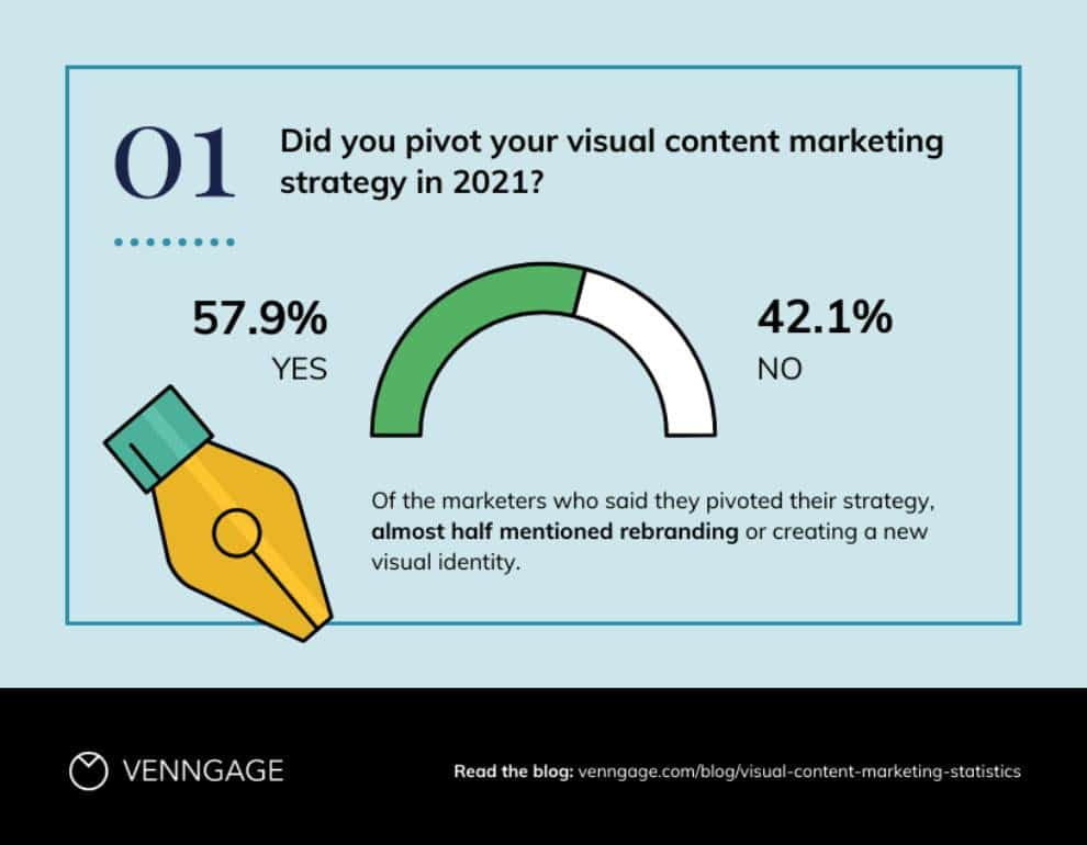
Creating original social media content can help you differentiate yourself from your competitors. According to Venngage’s visual content marketing survey, 57,9% of marketers said that creative visuals helped them meet their marketing objectives in 2021.
Source: https://venngage.com/blog/visual-content-marketing-statistics/
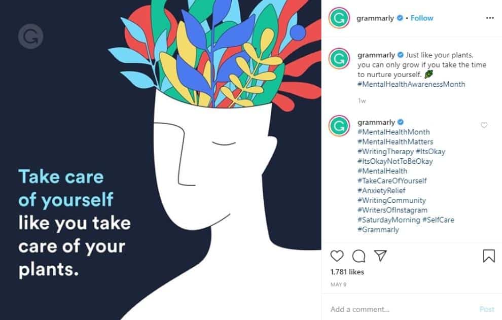
So, share your visuals (icons, pictures, infographics, graphs, memes, charts, and videos) to express your concept effectively and provoke reactions. You may also use them to make quotations and everyday visuals more lively.
Source: https://www.instagram.com/grammarly/
Determine the central focus point.
The focus point must be identified for the design to be successful. It is especially crucial when generating pictures for social media web design since you must make the most of the restricted area.
Begin by selecting the key idea you want to share using the image. While it may be tempting to say a lot, it is best to keep your message focused to stop confusing consumers.
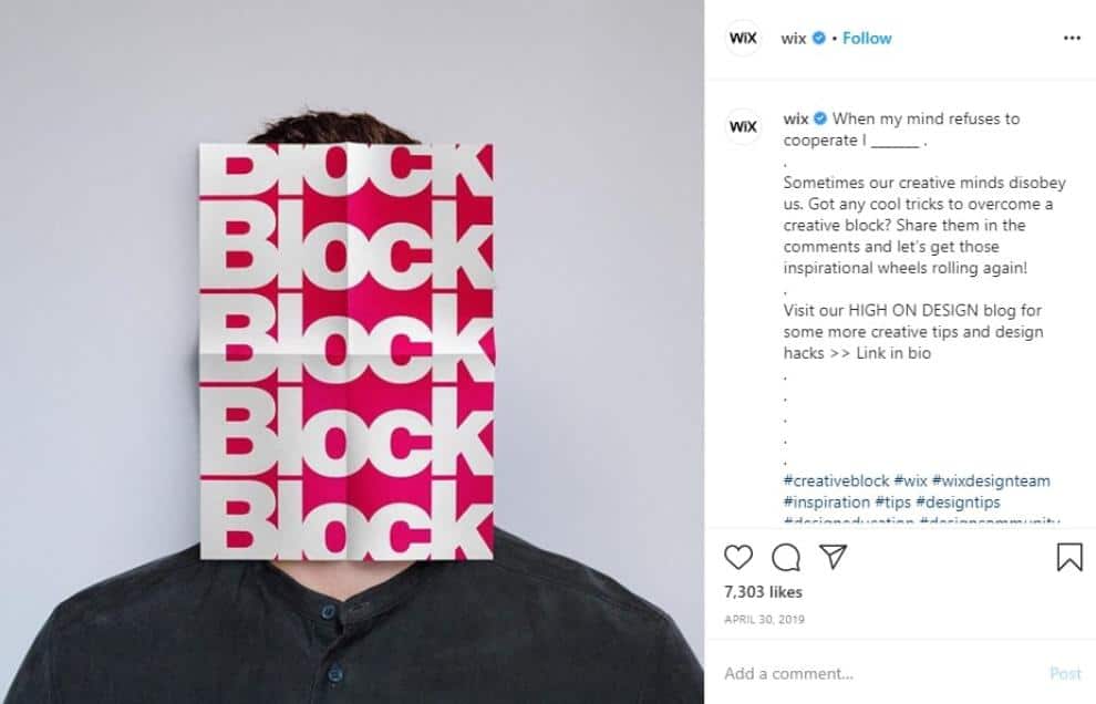
Once you have decided what you want to say, you will need to choose a focal point and create your graphic around it. It draws attention (in the proper spots) and allows you to deliver your point more effectively. By the way, you can take advantage of ready-made social media design templates free.
Here is an illustration of very effective communication, and the image just serves to enhance it.
Source: https://www.instagram.com/wix/
Be consistent with your content.
Examine your social media feed. Does it appear to be a mishmash of unrelated postings? Does it appear to adhere to a single brand? If you lean toward the first, it is time to change your approach to social media design.
Consistency is essential for developing a strong visual brand on social media. Now consider any renowned company. The idea that you can associate it with a certain color or font demonstrates the significance of brand identification.
Create a branding guideline for your company that includes components like colors, fonts, templates, themes, post formats, and editing style. It should be your go-to resource for all branding matters.
Take a look at Imbdata postings – they are consistent and cohesive.

Source: https://www.instagram.com/ibmdata
Make sure to simplify your social media design.
The Internet world is complicated, and there is a significant amount of data for customers to sort out. There is no need to make people more confused than they are these days.
So, do you prefer to be effortlessly recognized? You almost certainly replied yes to the second question.
Simplified designs are advantageous for a variety of reasons. Firstly, they stand out from the crowd of intricate graphics. Some social media design services prefer them but multiple users do not comprehend posts within a few seconds, so they may consider them useless.
Another explanation of why basic designs succeed is the massive increase in mobile usage, which has altered how consumers interact with posts. Since mobile devices have smaller displays, text, and graphics are compressed.
A Few Words in Conclusion
In today’s world, visual visuals are incredibly significant. It allows you to differentiate yourself from the crowd of competitors. Social media accounts are intended to interact with your community and raise brand exposure. As a result, to create the greatest social media posts, you must have a solid approach.
While these suggestions can undoubtedly help you improve your social media game, you should be aware that there is no set plan for your postings. However, we attempted to summarize the most valuable tips in this post. Ideally, it will be of immense help. Thanks for reading!


