Building a strong visual identity across all platforms (including social media) is a pivotal piece in the overall brand identity puzzle that simply cannot be ignored.
With online users taking just a few milliseconds to judge the visual charm behind your brand, grabbing the attention of avid scrollers lies in showcasing a strong visual identity. To back this up, the following stats speak volumes.
The vast majority of the information sent to the brain is visual, after all. While blending all the key visual triggers to strengthen your brand can seem a monumental task, things don’t need to be overly complicated for your brand to stand out.
Whether you’re wondering what font is most attractive to customers, what different colors can say about your brand, or just generally why visuals are so crucial when building a social media brand, we’ve got it all covered! Let’s dive in.

Free to use image sourced from Pixabay
What Is the Most Attractive Color in Marketing?
When discussing the topic of visual identity, the first thing that comes to mind is, almost certainly, color. But how do you pick the right color for your social media brand, and what do different shades communicate about your brand?
First of all, let’s look at some stats. Approximately 40% of Fortune 500 companies use the color blue in their logos, closely followed by black and red. Nike, Apple, and Coca-Cola are just three of the top logos voted most visually appealing by consumers.
Think about the colors they use; blue, black, and a combination of red and black. This is no coincidence. Choosing your branding colors carefully can really make a difference in how customers perceive your offering and drive sales and engagement.
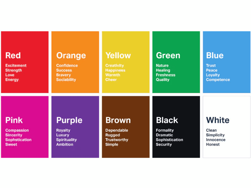
To choose the most effective brand colors, understanding the meanings behind them is a good place to start. Here we look at the five most popular logo colors of the moment:*
- Blue = Trust, peace, loyalty, competence.
- Red = Excitement, strength, love, energy.
- Black = Formality, dramatic, sophistication, security.
- Green = Nature, healing, freshness, quality.
- Gray = Neutrality, balance, calm.
*Correct at time of publishing.
 Image sourced from blog.hubspot.com
There isn’t a specific formula to accurately define how your target audience will react to specific colors and visuals. But, again, it’s not an accident that the most recognizable brands tend to use a combination of blue, black, gray, and white to signify competence, sophistication, balance, and honesty.
What Is the Most Visually Appealing Font?
Alongside a color palette, typography, typefaces, and fonts significantly affect the overall look, feel, and effectiveness of brand awareness on social media, too. Typography focuses on the arrangement of the text, whereas the typeface is what you see, and the font refers to variations of that typeface, e.g., regular, bold, or italic.
So, if you’re wondering what font is most attractive to customers, we’ve done the homework for you!
Sans Serif
With over 200,000 typefaces to choose from, Sans Serif comes out on top. Serif typefaces feature small lines that finish off the stroke of the letters, whereas Sans Serif doesn’t include these.
Apple, Google, and Microsoft all use sans serif. Capitalizing on its minimalistic and simple qualities, sans serif is a popular choice in visual branding because it’s perceived as more modern than traditional serif fonts these days – appealing to the millennial ideals of modernism and sophistication.
All Caps Logos
Standing out more than lowercase letters, the most popular text style for logos is all capital letters. Capital letters also give an air of authority that makes the brand feel more premium, which is why they tend to be used in luxury branding. Consider using a logo maker tool to experiment with different text styles and capitalization options to find the perfect fit for your brand’s identity.
Memorable luxury brands that effectively use capital letters to convey prestige and elegance include Gucci, Tesla, and Rolex.
It’s also interesting to note that more than half of the best brands are named with made-up words or acronyms (72%). So, to create a visually appealing brand name, think about substituting vowels and consonants, incorporating onomatopoeia (words spelled the way they sound), or blending words together for maximum effect.
Visually Appealing Slogans
Visually appealing slogans are short and sweet, authentic, catchy, and keep focus on the audience rather than the company.
“Just Do It’, “I’m Lovin’ It,” and “It’s Finger Lickin’ Good” are all prime examples of instantly recognizable slogans. They’re successful because they embody the company mindset and get to the heart of the matter.
It’s also important to remember that your domain name is a fundamental part of your brand’s visual identity too. Boosting trust and loyalty in your offering, if you’re at the stage of looking for ideas for domain names, identify key terms that your audience is searching for to delve deeper into their main wants and needs.
Visual Identity: Key Benefits for Social Media Branding

Free to use image sourced from Pixabay
Similar to the way URL extensions help businesses build their identity within a specific industry, there are various reasons why visuals are crucial to building a brand’s identity on social media. Let’s discover what these are.
It Creates Instant Brand Recall
With a unique visual identity that makes you stand out, consumers can quickly and easily remember your brand, whether it’s from a logo, slogan, marketing campaign, or even the color palette that you use on your Instagram profile.
It Builds Trust, Credibility, and Loyalty
Striking designs and consistent visuals go a long way in fostering a sense of professionalism, competency, and credibility. Over time, the familiarity of using consistent colors, fonts, and logo designs across your social media platforms can boost customer loyalty too.
It Gives You a Competitive Edge
In the crowded social space, a unique and memorable visual identity will set your brand apart from competitors. Doing so, in turn, can enable you to reach your target audience ahead of your rivals – and with more chances of success.
It Tells Your Story
Colour, imagery, typography, and other design elements can help share your brand’s story. Through your mission, values, and personality, you can build real emotional connections with target audiences. Optimizing your visual identity through consistent social media branding humanizes your brand, making your brand more relatable over time, too.

Free to use image sourced from Unsplash
It Maintains Brand Consistency
Making sure your social branding is consistent across multiple platforms reinforces your overall brand image. Having more choices also puts consumers in the driving seat to deliver a more satisfying experience all around.
It Provides Better Levels of Engagement
Inundated with thousands of images, videos, reels, and stories every single day, visuals are the lifeblood of social media. Quite simply, visually appealing content entices consumers to engage more. So, by aligning a strong visual identity with your brand, more shares, likes, and comments should follow.
It Demonstrates Adaptability
Catering to a wide range of content formats celebrates cultural diversity. Eliminating the need for a complete overhaul, it also makes updating design elements in line with evolving design trends easier and quicker. With the rise of mobile phone use, responsive web design that adapts to different screen sizes and orientations ensures a consistent brand experience across multiple devices and platforms too. A professional web design company can help implement these strategies effectively, ensuring your website remains modern and user-friendly. If you run a design company, chances are that you’ll need a web design invoice receipt template to bill for your services.
It Makes It Easier to Scale Up
Maintaining a consistent and cohesive brand presence across various platforms helps unlock new audiences and possibilities. Creating a visually appealing brand that awakens positive emotions will help you identify with more customers, clearing the way toward your scale-up dreams.
What Is an Example of Visually Strong Social Media Branding?
Visual social media strategies and branding continuously evolve over time. However, certain visual triggers can be applied to various platforms to strengthen social media branding.
To put it into context, here are some examples to clarify things further.
Consistent Color Palettes
Maintaining a consistent color palette across multiple social platforms whilst integrating marketing communications provides a seamless user experience. Used correctly, they can convey specific moods or characteristics linked to your brand.
Any marketer worth their salt knows using consistent repetition in advertising enhances brand recall – and the same goes for your branding colors. With more than 9.3M likes on Facebook and over 500K followers on Twitter (X), you only need to glance at Snicker’s social feeds and you’ll notice the same logo colors used over and over again.
Featuring mouthwatering visuals of this favorite sweet treat on every single post, if you look closely, their logo color combination and crisp blocks of color (bar the brown) is very patriotic in themselves. Utilizing colors that portray strength, energy, and trust, this intuitive use of color across their socials has helped them retain their crown as the U.S’ top-selling candy bar brand.*

Screenshot sourced from Facebook
*Correct at time of publishing.
Typography That Reflects Brand Personality
Font choices are just as important as your color palette. Using the same fonts for your logo design, headlines, and body text will reinforce a unified brand identity across multiple social platforms. Effective typography has good readability online and can be optimized for multiple devices, including mobile.
Nike is well known for its motivational social content, and when they post visuals, they use their geometric brand font Futura to really stand out. Sleek and modern, the way this typeface depicts motion, speed, and success goes hand in hand with the sentiment behind their Swoosh logo.
Use Mascots to Help With Visual Branding
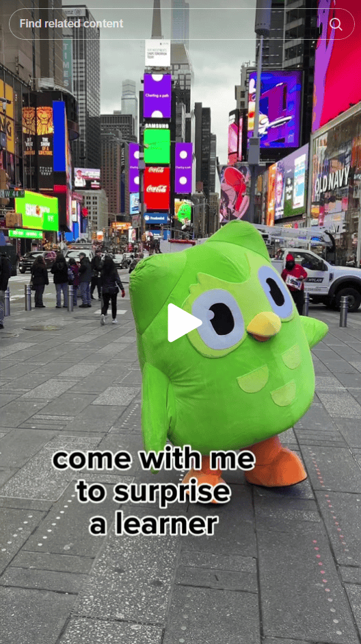
Forward-thinking brands are using mascots to drive visual brand consistency on social media too. Boasting over 9M followers on TikTok and almost 2M followers on Instagram, the popular language learning app Duolingo has got this visual trigger spot on.
Appealing to all ages, Duo the green owl not only matches their recognisable logo, he features heavily across its social media presence too. Cleverly using this adorable little owl across all platforms helps create a solid visual and emotional connection, fosters trust, and drives engagement and sales. To further strengthen this consistency, brands can extract a color palette from image sources to ensure their mascots and supporting visuals always align with the overall brand identity.

Screenshot sourced from TikTok
10 Ways to Build Visual Appeal on Social Media
To create unforgettable visual content for social media, here are ten ways to get started.
- Create a range of visual content; photos, videos, carousel posts, GIFS, illustrations, infographics, animations, memes, and even business cards with qr code!
- After intensive research, pick a certain color palette and stick to it.
- Use social media filters to maintain a consistent color scheme.
- Follow the ‘3E’ thumb rule for creating engaging social media posts: educational, entertaining, and enlightening.
- Choose captivating thumbnails for videos (cover images), and communicate enough information to make it visually appealing without giving too much away.
- Add visually appealing captions and quotes.
- Combine text with imagery but be careful not to overwhelm your audience. Remember, less is more.
- Repurpose content.
- Use social media automation tools to save time, so you can build visual appeal even further.
- Avoid using blurry and out-of-focus visual content. Optimize images using high-quality photos and videos only.
Final Thoughts on Strong Social Media Branding
Just like cheap makeup can harm your skin, inferior visual branding can seriously damage your visual identity. The strongest visual identities cut through the confusion to communicate the essence of your brand with ease and finesse.
Armed with the best tools to build a strong social media brand identity, marketers, freelancers, website owners, and more can harness the power of visual identity within their social branding to accelerate profits, growth, and consumer confidence.

