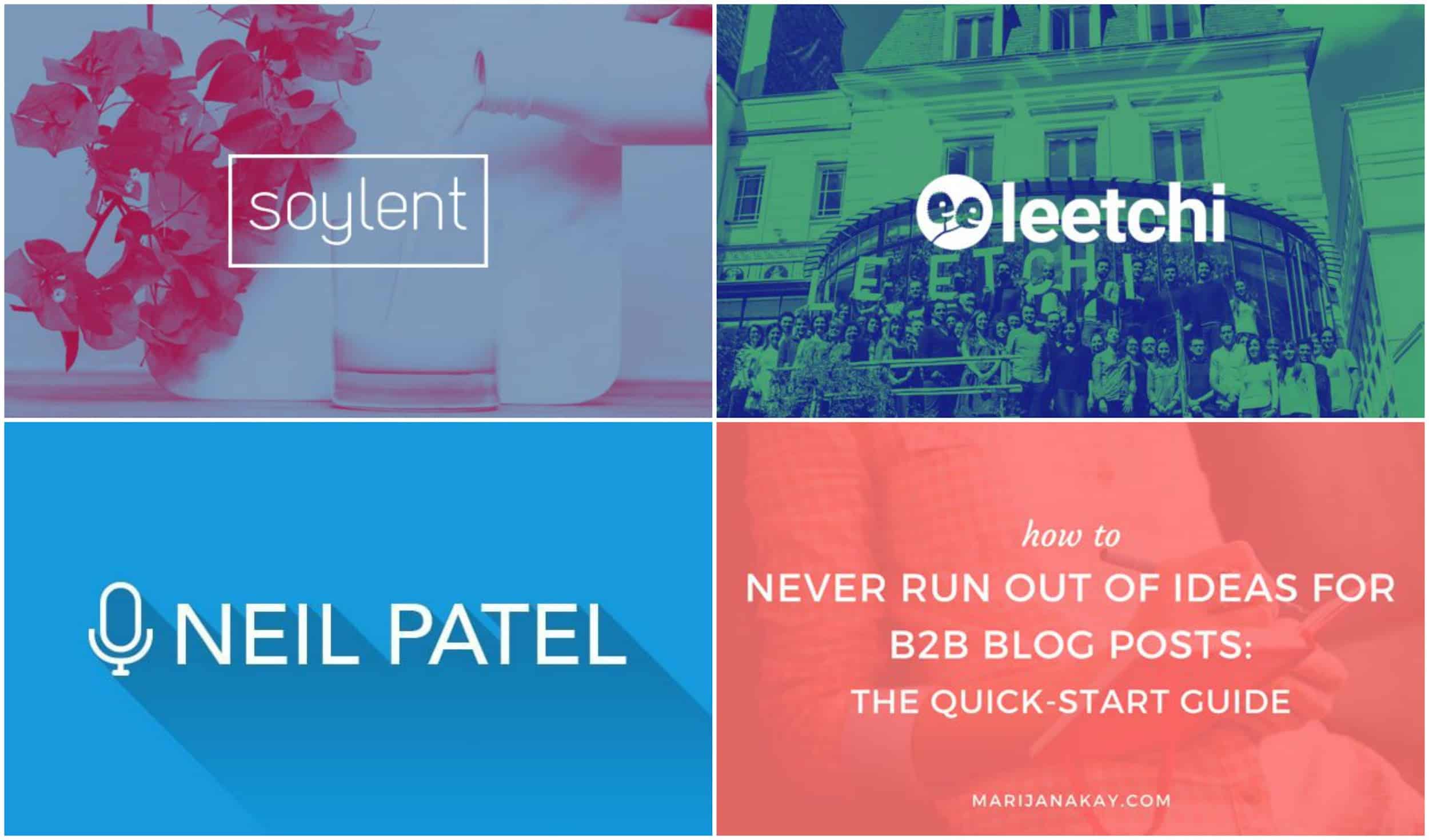
We are in a new age of content overload in 2026. And now, more than ever it’s important that you get the most out of your social media graphic design.
Did you know that…
[clickToTweet tweet=”Did you know that each day 500 million Tweets are sent.” quote=”Each day 500 million Tweets are sent.” theme=”style1″]
[clickToTweet tweet=”Did you know that each day 95 million photos added to Instagram.” quote=”95 million photos added to Instagram.” theme=”style1″]
[clickToTweet tweet=”Did you know that each day 35 million status updates on Facebook.” quote=”35 million status updates on Facebook.” theme=”style1″]
[clickToTweet tweet=”Did you know that each day 14 million articles are pinned on Pinterest.” quote=”14 million articles are pinned on Pinterest.” theme=”style1″]
There is literally too much content on social media, and it’s only going to get worse.
Back when these social media platforms started you could stand out with some interesting shares and a few interesting stock photos. But that isn’t going to cut it in 2026, you are going to have to do more.
The best place to start is by upgrading your social media graphic design. Because those graphics and images are going to be what helps you stand above those billions of daily shares.
After studying how hundreds of top brands use social media visuals I was able to find out exactly what makes them successful. That is why I put together these 4 social media graphic design hacks.
And best of all, these hacks are a great place for any type of marketer or designer to begin. So let’s jump into it!
Create a few reusable templates in your social media graphic design
Not every team has the time, or bandwidth, to create fully unique social images for each of their shares or articles.
That would be an impossible task even for the some of the larger marketing teams.
I have seen many people take the easy way out and just use a stock image because that task seems to difficult.
On the other hand, there are some people who go for social media mockups and slide templates to create a unique brand image overall on social media profiles.
[clickToTweet tweet=”Using a boring stock image is never a good answer. Instead, what you should do is create reusable template with only a few moving parts.” quote=”But using a boring stock image is never a good answer. Instead, what you should do is create reusable template with only a few moving parts.” theme=”style1″]
Then you don’t have to reinvent the wheel each time you need to create a unique social image.
It may take a little bit more time to get the template set up, but after that you will have a new graphic in a few seconds.
It’s as easy as swapping an icon, changing the title or updating the background image. You can even change the background of a photo every month. And boom you have a new graphic for your shares. Kinda like what Moz has mastered lately on all of their social images:
Each has a similar feel and theme, which is an excellent way to project a unified visual brand as well. But they are different enough that your audience will see them as unique visuals.
This method is ideal because now anyone can make those simple adjustments. Your marketing team is no longer waiting on designer or another team.
Plus, if you keep a consistent style on each of the templates your followers will immediately recognize one of your shares.
And in a crowded social space, that makes a huge difference.
Even at Venngage we use this approach for all of our social shares, to a less rigid degree. Whereas, the examples from Moz were almost direct content swaps, ours take advantage of a little more creative freedom:
As you can see, we change the icon and the bold background color on each but they all still feel consistent. This helps our shares feel like they are coming from a single voice, not a random group too.
Also when your social images have some guidelines, it makes them a lot easier to create. Your designers aren’t pulling stuff out of thin air but following directions.
They will thank you for this.
2. Never use raw stock images when creating social media imagery
I know I said you should never use stock images for your social shares already. But what I should have said was never use raw stock images.
Don’t download a vague stock image and then slap it on your share. That is the mark of a lazy content creator.
It instantly tells your followers that you didn’t care about your content enough to use a custom graphic.
So why should they? Exactly.
That is why I tell every new content creator to stay away from raw stock images completely.
What you can do is use that stock image as the base of your new social graphic.
The designers over at Fast Company do exactly that with a gradient overlay:
And it makes their content stand out in a very competitive news industry. Now instead of having a boring stock image, they have an interesting graphic to share.
Plus gradients are back in a big way this year.
Another way to upgrade a stock image is to add your company branding or logo:
Think Growth does this with all of their shares and I think it works exceptionally well. Their followers will recognize that branding out in the world and be drawn to it.
And it stands up above all the unedited stock images and noise clogging up a social feed.
Actually, they can even use this as a template for any stock image they choose. This is a perfect example because it illustrates both points so well!
Now if you don’t want the stock image to be your main focal point, I would recommend following these examples:
These graphics, from Wishpond, all utilize stock images but only in the background. The text then becomes the main focal point and can be used to add a little context to each share.
Something like this is a great way for a non-designer to create some interesting visuals as well. Actually, text heavy graphics were what I created for the first two years of my career, and I was no design pro back then.
3. Utilize bold & bright colors in social media graphic design
Bold colors is a big trend that is going to take over graphic design this year, and social media isn’t immune.
As brands move further away from minimalism that dominated the last decade, color will explode across their graphics.
This is very exciting because bold color helps your shares and graphics stand out immensely.
If you haven’t noticed, most social networks have a white or neutral background color. This means that light or white social images almost fade into the background. You can simply use any free flyer maker available on the internet to make professional designs in minutes.
Your followers will scroll over those shares without even meaning to. But graphics that use bold or bright colors will jump off the page and grab their attention.
Dropbox was one of the first large brands to put bold colors at the forefront of their brand identity:
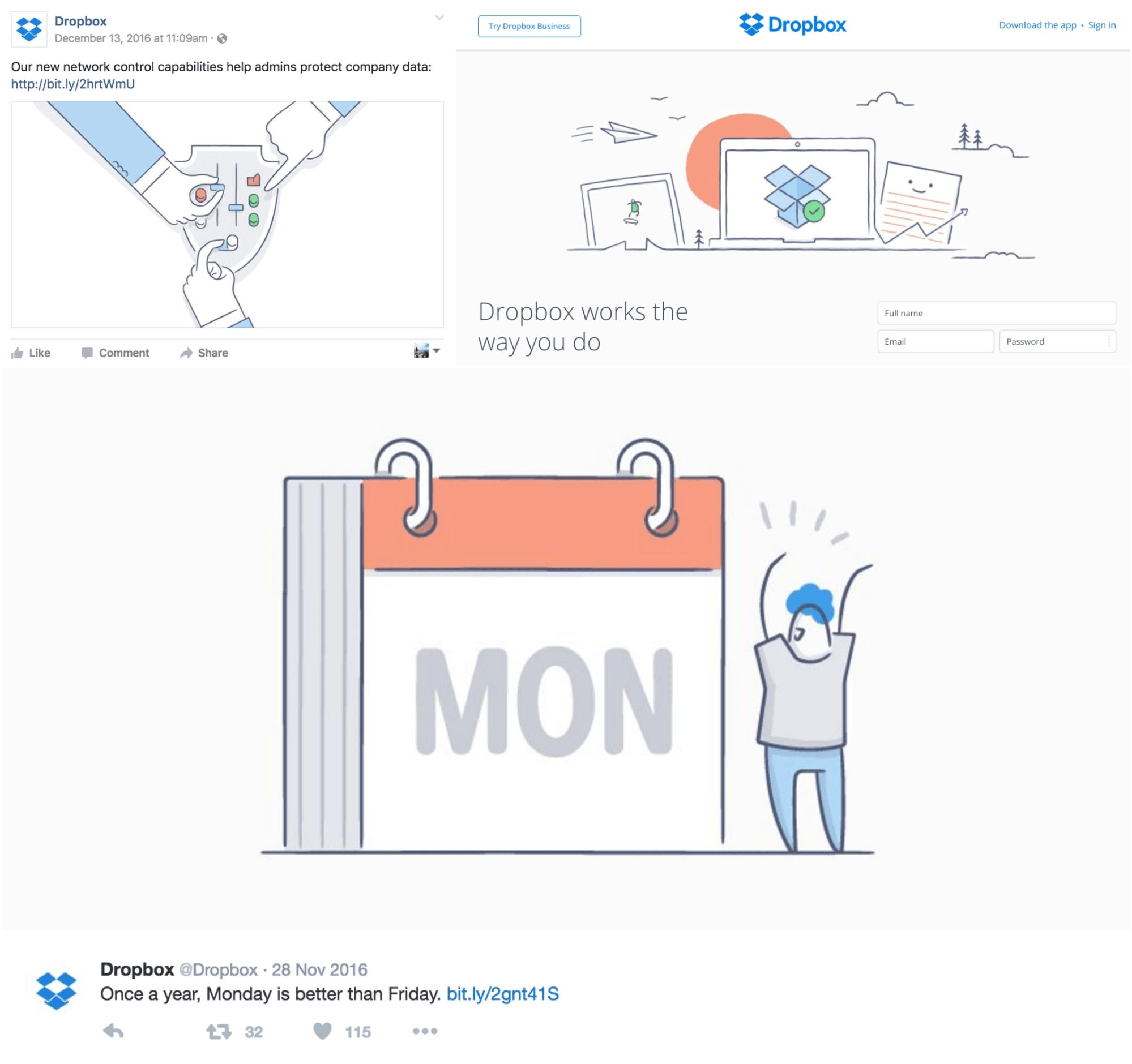
They ditched the boring graphics of yesteryear:
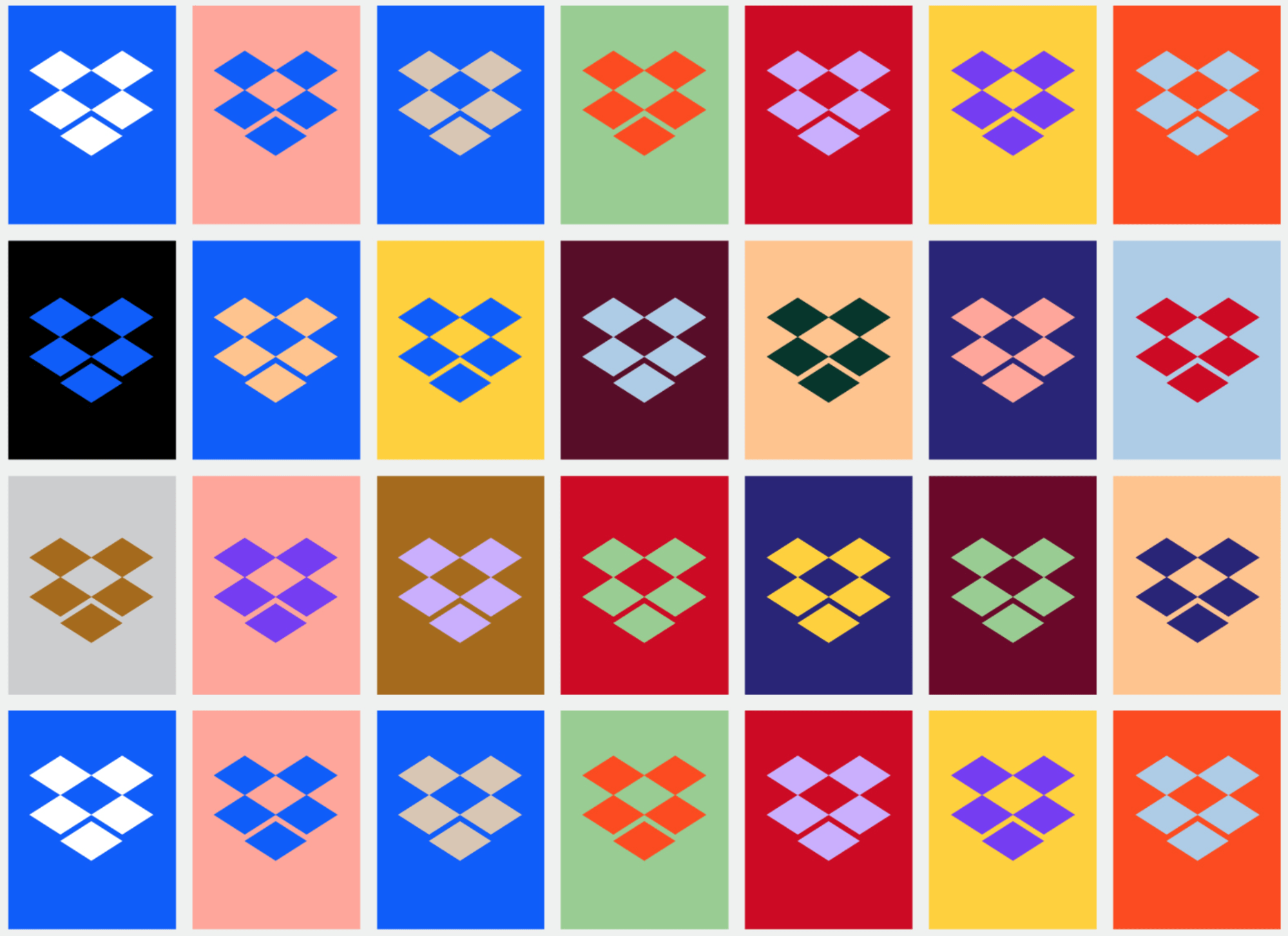
And embraced bold color fully:
Now their shares stick out like beacons of interesting content in sea of mediocre shares.
eBay did something extremely similar recently and used bold color to find their groove again:
Almost overnight, they added a refreshing amount of bold color to all of their products and shares. Not only did this move upgrade their shares, but it also brought millions of products under one visual identity.
Now anytime I see a graphic like that I automatically know it came from eBay.
And if that isn’t a sign of successful rebrand, I don’t know what is.
I know that not every company can completely change their branding this year. But you always can inject a little bit of bold color into your shares. Like PostFunnel does so elegantly:
Each of their social graphics only use a bit of bold color, but they are still extremely eye catching. And because they use this on all of their graphics, it quickly becomes part of their brand identity.
Just because bold color is going to take over 2026, that doesn’t mean it has to completely dominate your graphics.
4. Have a simple or central focal point in social media visuals
If you have been paying attention to most of the examples I have compiled for this article you may have noticed a theme.
No it’s not that they all use bold color. Or that they all come from a diverse group of companies.
Actually, they all are relatively simple. With Dropbox being the exception, most of these brands do big things with graphics that are uncomplicated.
They do this by making sure each image has a central focal point. This point that draws your eye to the image could be a central icon, title or graphic.
[clickToTweet tweet=”I think that some social images fail because they try to do too much, instead of having a single focal point.” quote=”I think that some social images fail because they try to do too much, instead of having a single focal point.” theme=”style1″]
If your image is too busy, the reader or follower will have no idea where to look. And those carefully curated images that you spent so much time on fade into the background.
Even stock images are too busy at times. I mean where are you even supposed to look at in the image below?
But when you use a simple focal point, like Axios does below, your graphics stand out extremely well:
Especially against the stock images and other foder that their industry uses so much. And it adds that extra bit of context that will intrigue their followers.
An effective social image should add some context or information content you just shared as well. And if it takes a follower more than a few milliseconds to figure out what your image is trying to say they will definitely ignore it.
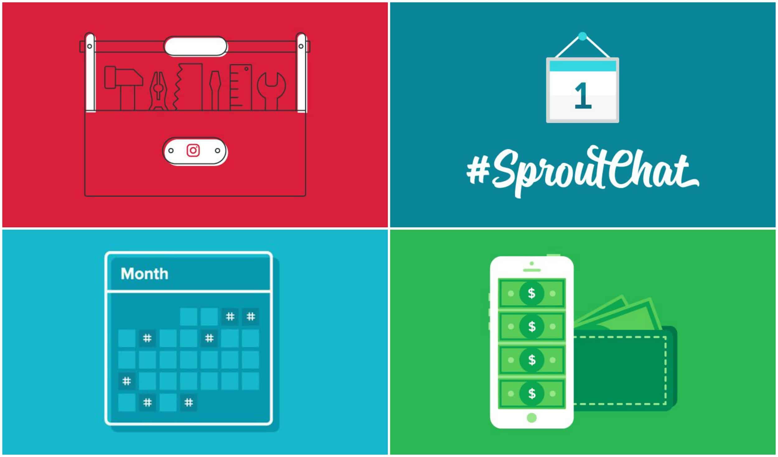
These examples from Sprout Social do just that in my opinion:
They add a little extra information to each share, without being boring and have a single focal point. Plus they use bold colors and follow almost a template. Overall it’s a good example of all the past ideas coming together to create an effective social image.
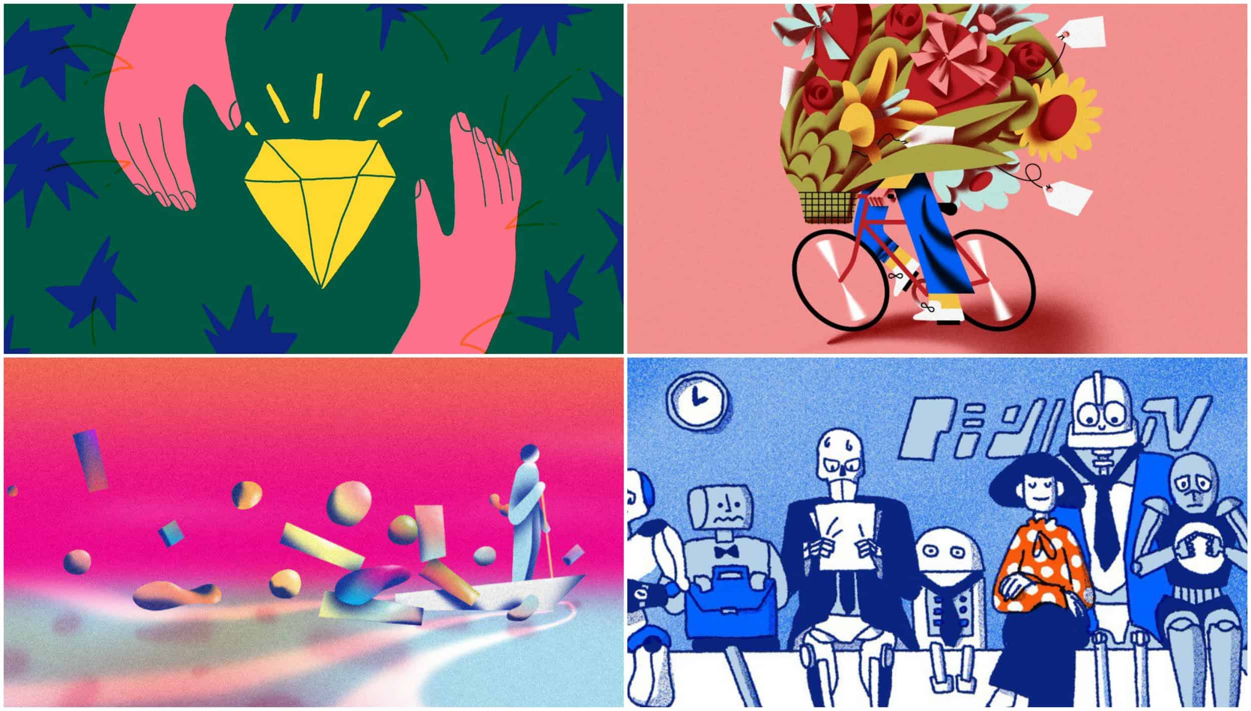
However, using a single focal point doesn’t mean your graphics have to be boring or minimalistic. Take a look at what SumoMe has been sharing lately:
They still use a single point of focus in all of their graphics but add some unique flourishes. This will help them stand out even more in a busy industry like the marketing world.
And if you want to add text to your graphics, I would follow Mention’s lead:
They keep it extremely simple and tell you all you need to know. PLus look at those awesome duotones, and bright colors!
—
There you have it, 4 tips to make your social media visuals succeed in 2026.
Just remember to:
- Create some reusable templates
- Avoid using raw stock images
- Utilize bold & bright colors
- And have a single focal point.
Also stop using boring stock photos for your social media graphic design!
They are the easiest way to turn people off of your shares. Or signal to them that you don’t really care about the content you are sharing.
If you follow those four guidelines I know that your shares will succeed in 2026 and beyond.
